12 Kitchen Cabinet Color Ideas You’ll Want to Copy Asap
Ready to give your kitchen a glow-up without tearing down a single wall? Cabinet color is the fastest way to transform the whole vibe. Think of it like a great haircut for your kitchen—low commitment, high reward, instant compliments.
From chic neutrals to bold showstoppers, these 12 ideas deliver serious style. I’ve packed each one with practical tips, undertone notes, and what backsplash or hardware plays best. Let’s paint your way to a kitchen you actually can’t stop staring at.
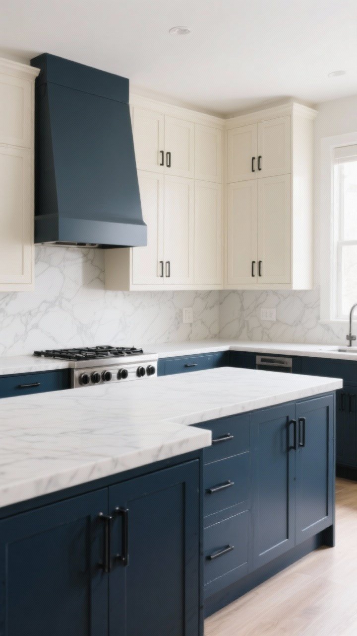
1. Moody Navy That Means Business
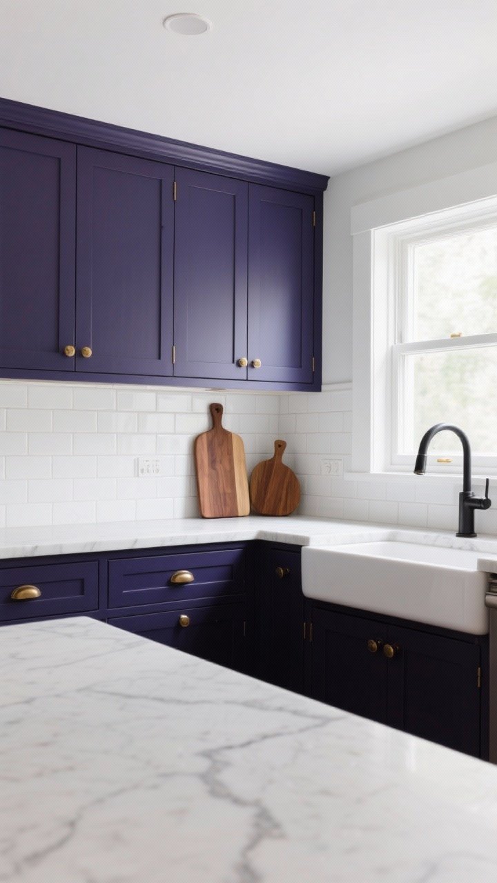
Navy cabinets are the little black dress of kitchens—timeless, sleek, and so flattering. They bring depth and drama without feeling loud, especially with brass or brushed gold hardware. Bonus: navy hides smudges and kid fingerprints like a pro.
Why It Works
- Classic + modern: Navy plays nice with both marble and butcher block.
- High contrast: Crisp white walls or a white backsplash pop against it.
- Undertone tip: Choose a neutral navy (not too purple) for longevity.
Style Pairings
- Backsplash: White subway, zellige, or light marble.
- Hardware: Warm brass or matte black.
- Countertops: White quartz or warm walnut for balance.
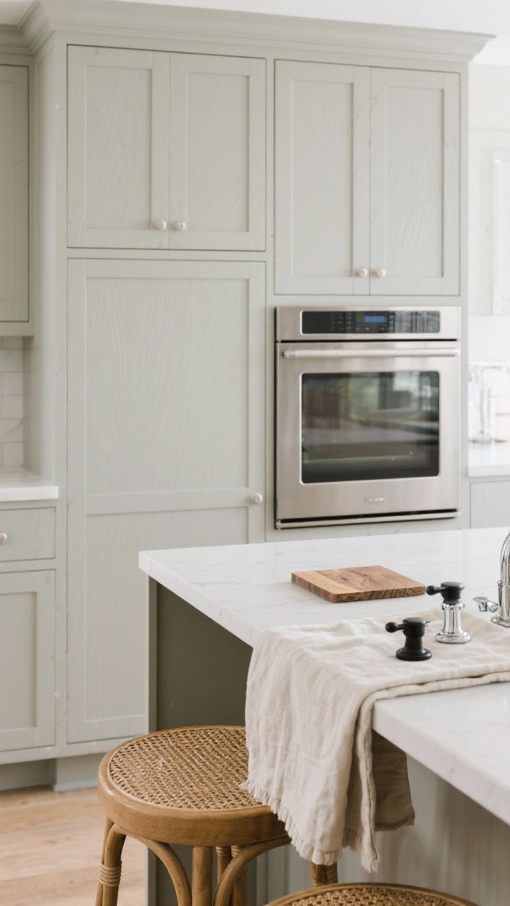
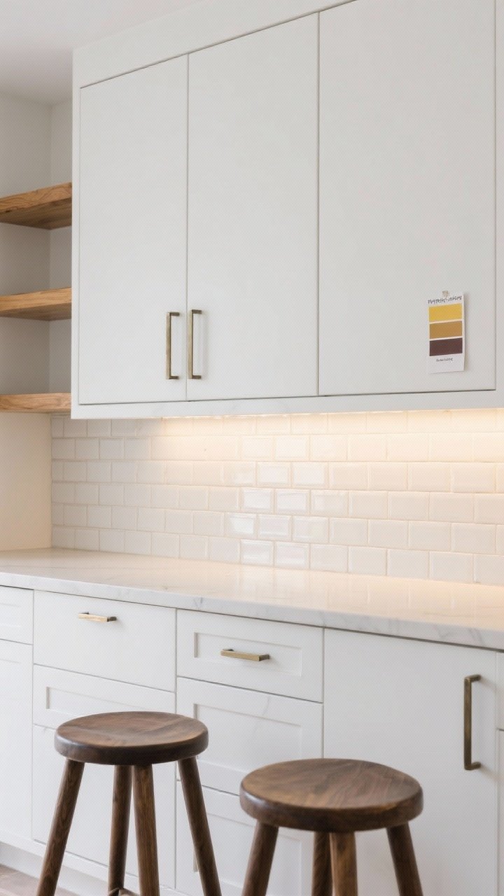
2. Creamy Off-White That Feels Like Sunshine
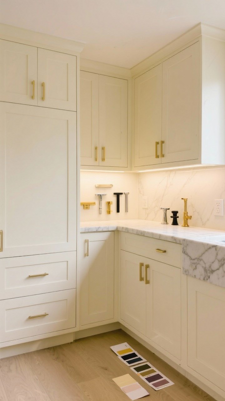
White cabinets are classic, but creamy off-white feels softer, warmer, and more inviting. It’s like hitting “warm filter” IRL—especially if your kitchen doesn’t get tons of natural light.
Why It Works
- Cozy, not sterile: Slight yellow/greige undertones soften the look.
- Timeless: Works with any hardware finish and backsplash style.
- Great for resales: Clean, bright, and buyer-friendly.
Pro Tips
- Swatch near flooring and counters—undertones shift next to warm wood or cool marble.
- Use a satin or semi-gloss finish for wipeability without too much shine.
3. Earthy Sage Green for Instant Calm
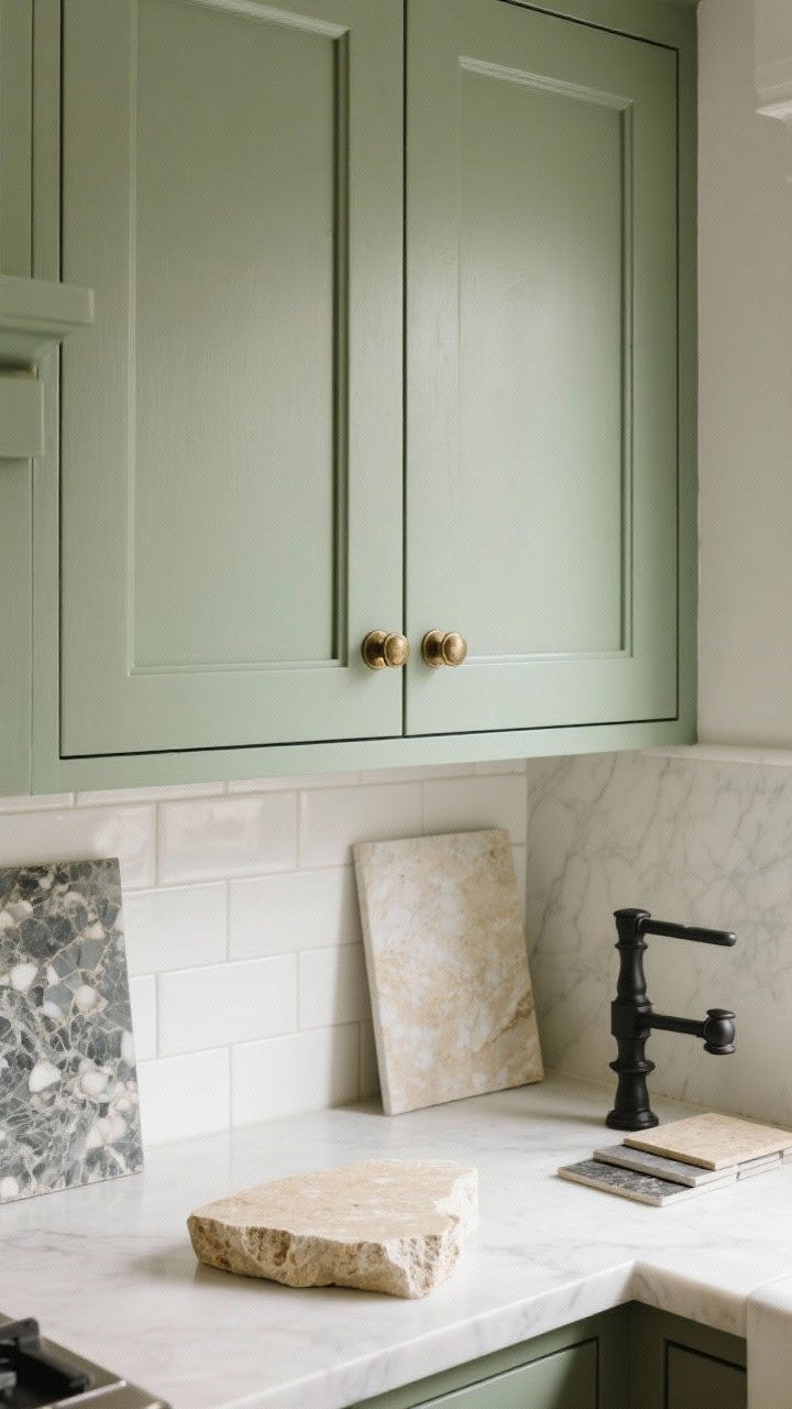
Sage green is the quiet luxury of cabinet colors—earthy, elegant, and endlessly soothing. It brings nature indoors and pairs beautifully with stone, wood, and black accents.
Why It Works
- Elevated neutral: Reads as color without overwhelming the space.
- Undertones matter: Look for sage with gray undertones for a grown-up vibe.
- Versatile: Works with traditional or modern styles.
Style Pairings
- Backsplash: Tumbled marble, soft white ceramic, or travertine.
- Hardware: Aged brass, antique bronze, or black.
- Countertops: Creamy quartz, soapstone, or warm marble.
4. Two-Tone Magic: Light Uppers, Dark Lowers
Can’t pick one color? Two-tone cabinets give you the best of both worlds. Light uppers keep things airy, while darker lowers ground the room and hide daily wear. It’s balance with a capital B.
Winning Combos
- Cream uppers + navy lowers for coastal-but-chic.
- White uppers + greige lowers for soft contrast.
- Sage uppers + charcoal lowers for earthy drama.
Pro Tips
- Keep hardware consistent to avoid chaos.
- Repeat the darker shade in a range hood or island to connect the palette.
5. Charcoal Gray That’s Effortlessly Cool
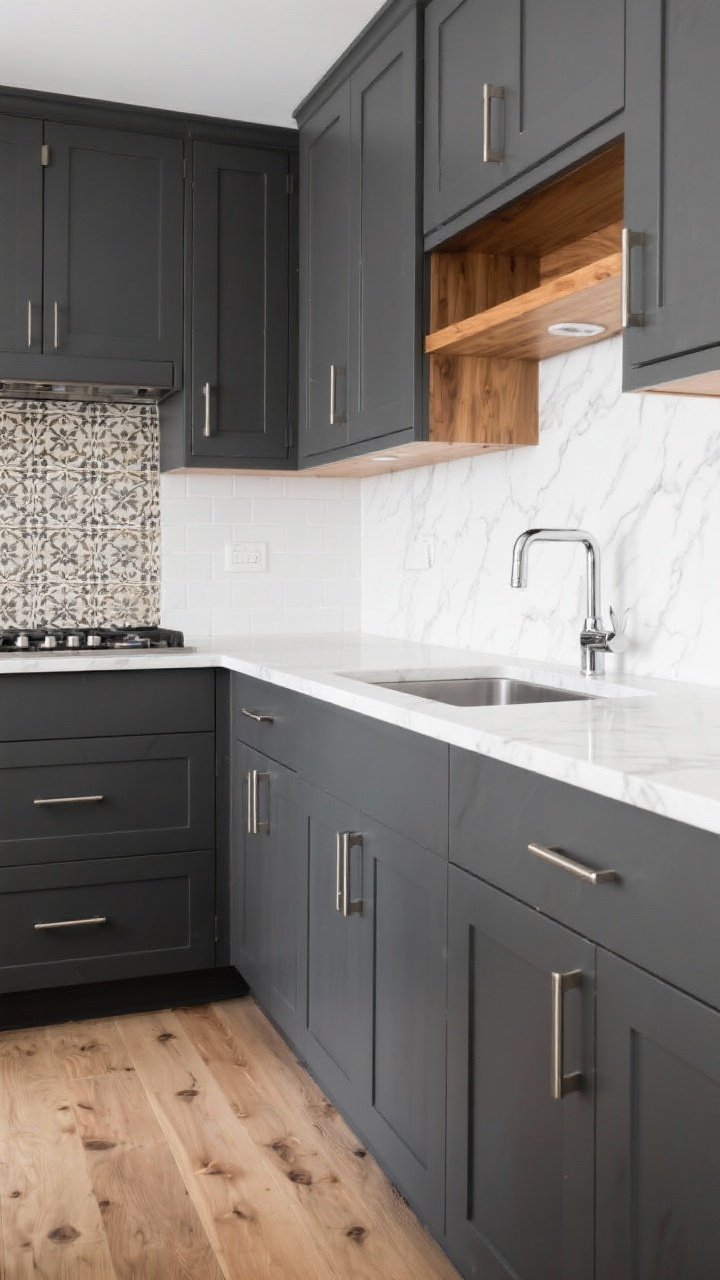
Charcoal cabinets are sleek but not severe—perfect if you want depth without going fully black. They’re modern, moody, and surprisingly forgiving with smudges and dings.
Why It Works
- Edge without gloom: Dark and sophisticated, but still soft.
- Pairing power: Looks amazing with warm wood and white oak floors.
- Lighting friendly: Works in medium to bright kitchens.
Style Pairings
- Backsplash: White or patterned encaustic tile.
- Hardware: Brushed nickel, chrome, or unlacquered brass.
- Counters: White quartz, marble, or concrete.
6. Soft Greige for That Designer Neutral
Meet greige, the designer-secret color that’s equal parts gray and beige. It’s warm, modern, and lets your backsplash and lighting do the talking. If you’re paralyzed by choices, this is your safe (and chic) bet.
Why It Works
- Undertone chameleon: Plays nicely with both cool and warm finishes.
- Light-friendly: Great in both sunny and low-light kitchens.
- Rental-proof: Appeals to basically everyone, FYI.
Pro Tips
- Test against stainless appliances—some greiges can flash purple.
- Layer in texture: rattan bar stools, linen shades, wood accents.
7. Black Cabinets for Bold Minimalists
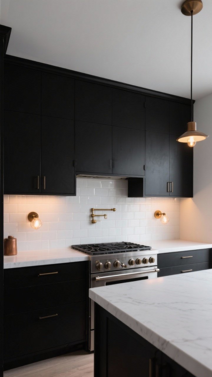
Black cabinets are high drama in the best way. Done right, they’re luxurious, modern, and surprisingly livable. Think: moody kitchen, candlelit dinners, chef energy.
Why It Works
- Statement maker: Instantly elevates even basic layouts.
- Texture + finish: Go matte or satin to hide fingerprints.
- Contrast king: Pops with white counters and warm metals.
Style Pairings
- Backsplash: White zellige, bookmatched marble, or grid tile.
- Hardware: Brass, bronze, or stainless for a pro-kitchen vibe.
- Lighting: Warm bulbs so it doesn’t feel cave-y.
8. French Blue for Soft, Elegant Color
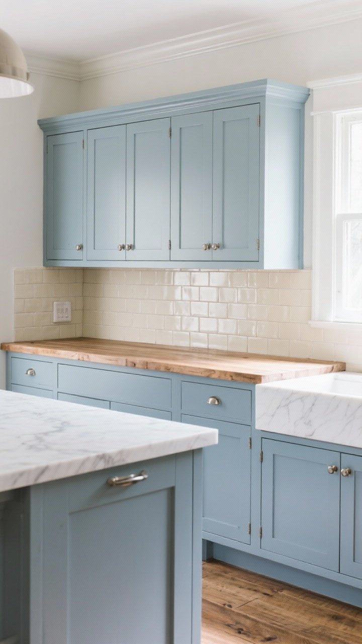
If navy feels too heavy, try French blue—a muted, slightly grayish blue that’s light, airy, and quietly luxe. It’s coastal without being kitschy and works year-round.
Why It Works
- Soft saturation: A color you won’t get tired of in six months.
- Mixes styles: Great in cottage, modern, or European-inspired spaces.
- Undertones: Look for gray-based blues to avoid baby blue territory.
Style Pairings
- Backsplash: Creamy subway tile or Carrara marble.
- Hardware: Aged brass or polished nickel.
- Counters: Butcher block or white quartz with light veining.
9. Forest Green That Feels Custom
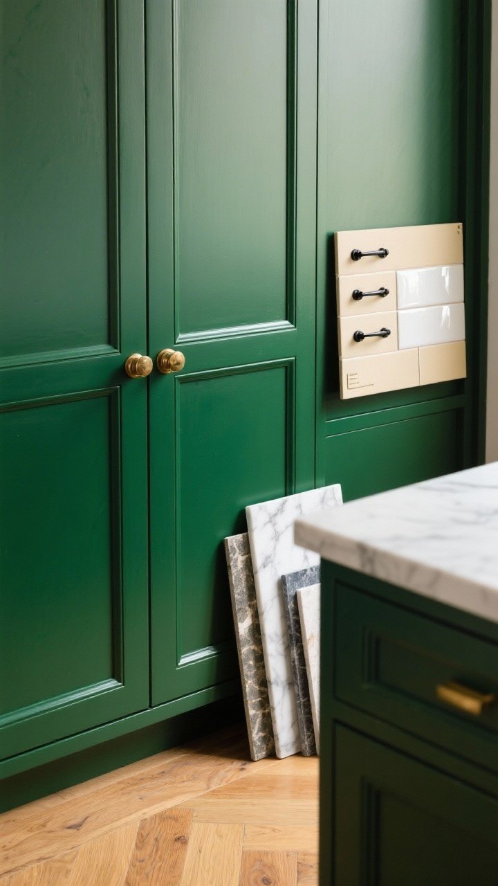
Going deep green reads like custom millwork—rich, grounded, and designer-level. It’s a color with presence, so let it lead and keep the rest simple.
Why It Works
- Organic richness: Connects beautifully with wood floors and natural stone.
- Timeless-but-now: Trendy, but rooted in traditional design.
- Perfect for islands: Use as an accent if full commitment is scary.
Style Pairings
- Backsplash: Creamy ceramics or glossy white tiles.
- Hardware: Brass or black for contrast.
- Counters: Honed marble, quartzite, or soapstone.
10. Warm Taupe for Modern Farmhouse Vibes
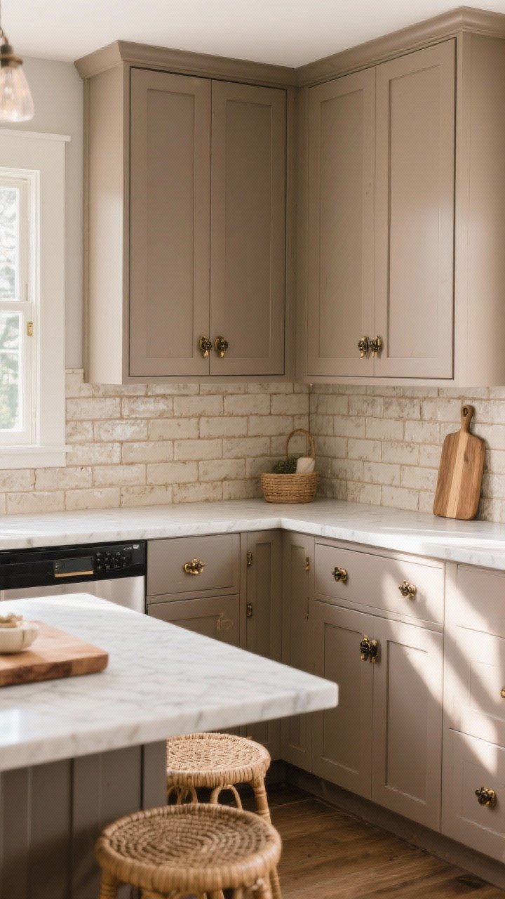
Taupe cabinets bring a cozy, collected feel—think modern farmhouse but make it chic. They’re warmer than gray and less yellow than beige, striking that just-right balance.
Why It Works
- Easy to live with: Soft, soothing, and super versatile.
- Undertones: Greige-leaning taupe keeps it modern.
- Texture friendly: Pairs beautifully with woven and wood elements.
Style Pairings
- Backsplash: Handmade tile or beadboard for texture.
- Hardware: Black or antique brass.
- Counters: Creamy or warm white quartz to keep it bright.
11. Crisp White With Texture (Not Boring, Promise)
White cabinets are classics for a reason—clean, bright, and endlessly flexible. The trick to keeping them from feeling flat is layering texture and warmth elsewhere.
Make White Feel Designer
- Add wood accents: open shelves, stools, or beams.
- Choose interesting tile: zellige, patterned, or stacked vertical subway.
- Use warm metals and soft lighting for dimension.
Pro Tip
- Pick a neutral white (neither icy nor yellow). Test in morning and evening light.
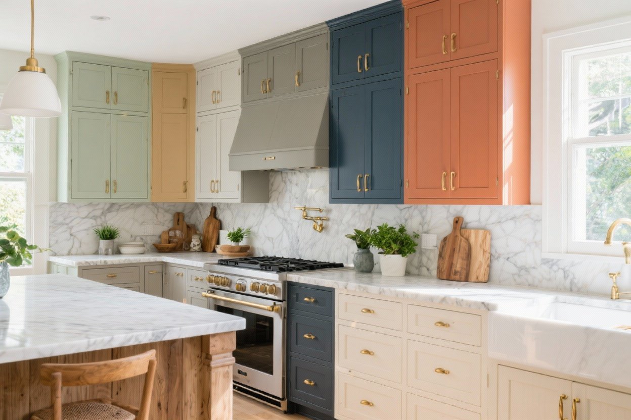
12. Terracotta and Clay Tones for Warm, Trend-Forward Style
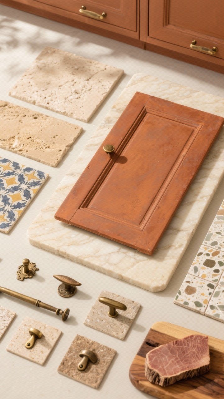
If you’re craving something fresh and earthy, try terracotta, clay, or muted rust on cabinets or just the island. It’s warm, welcoming, and pairs insanely well with stone and wood.
Why It Works
- Instant warmth: Makes the kitchen feel cozy and lived-in.
- Mediterranean moment: Channels European charm without feeling themed.
- Great accent: Use on lower cabinets or island if you’re testing the waters.
Style Pairings
- Backsplash: Cream or sand-toned zellige, travertine, or terrazzo.
- Hardware: Aged brass or oil-rubbed bronze.
- Counters: Creamy quartzite, limestone, or butcher block.
Bonus Section: Finishes, Sheens, and Practical Tips
Okay, not a color—but some quick tips so your paint job lives its best life.
- Sheen matters: Satin or semi-gloss is easiest to clean; matte shows more wear.
- Prep is everything: Degloss, sand lightly, and prime with a bonding primer. Your future self will thank you.
- Test big swatches: Paint poster boards and move them around the kitchen to see the color in different light.
- Undertones check: Hold swatches next to counters, floors, and backsplash. They all talk to each other, IMO.
- Hardware harmony: Warm colors love brass/bronze; cool colors love chrome/nickel/black.
- Consider wear zones: Dark lowers and light uppers are both practical and pretty.
Suggested Color Families to Sample
- Navy: Deep, neutral-leaning navies without violet undertones.
- Cream: Soft whites with a hint of warmth, not yellow.
- Sage/French Blue: Muted, gray-based versions for sophistication.
- Charcoal/Black: Matte-friendly formulas to hide fingerprints.
- Greige/Taupe: Balanced undertones that won’t turn pink or purple.
- Forest/Terracotta: Rich, earthy shades with low saturation for longevity.
There you go—12 kitchen cabinet color ideas that actually move the needle from “fine” to “wow.” Whether you go moody navy, calm sage, or bold black, the right color can make your old cabinets look totally custom. Grab a few sample pots, paint big swatches, and trust your gut. Your dream kitchen is a paintbrush away.