12 Two-tone Kitchen Cabinet Combinations That’ll Make Guests Do a Double-take
Ready to give your kitchen a glow-up without gutting it? Two-tone cabinets are the fastest way to add depth, style, and that “oh wow” factor—without replacing your countertops or buying a single fancy appliance. Think of it like contouring for your kitchen: strategic color placement, instant definition, and major personality.
Below are exactly 12 two-tone kitchen cabinet combinations that work in real homes (not just Pinterest fantasyland). We’re talking color pairings, finishes, layout tips, and sneaky design moves that make your space look custom—even if it’s not. Let’s play with color.
1. Inky Navy + Crisp White: Coastal Cool Without the Seashells
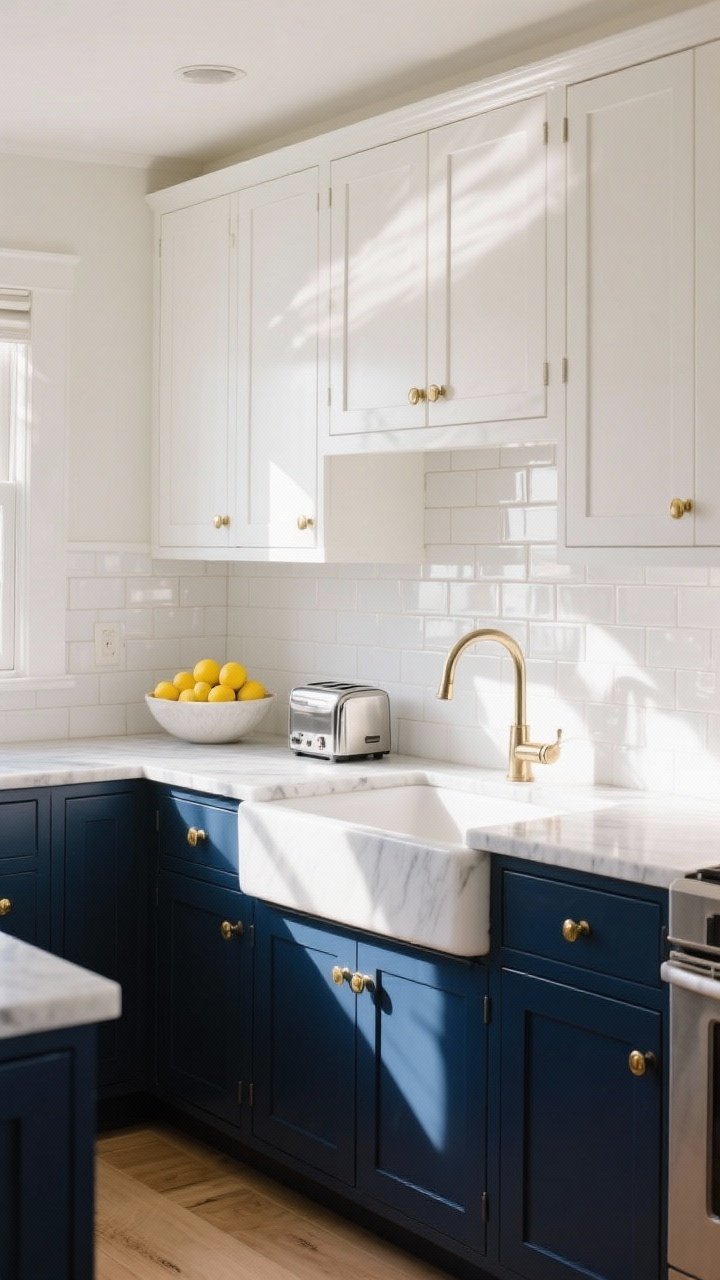
Classic for a reason. Navy lowers ground the space, while white uppers bounce light and keep things feeling fresh. It’s coastal, but not theme-y—more “Cape Cod chic” than “seahorses on everything.”
Why It Works
- Contrast adds dimension and draws the eye across the room.
- White uppers prevent the kitchen from feeling heavy.
- Navy plays well with brass, chrome, or black hardware.
Pro Tips
- Pair with brass pulls for a luxe twist or polished nickel for a nautical nod.
- Use warm white on uppers if you have warm lighting or floors—stark white can skew blue next to navy.
- Finish it off with marble or quartz counters for chef’s-kitchen energy.
2. Sage Green + Cream: Calm, Earthy, Effortlessly Chic
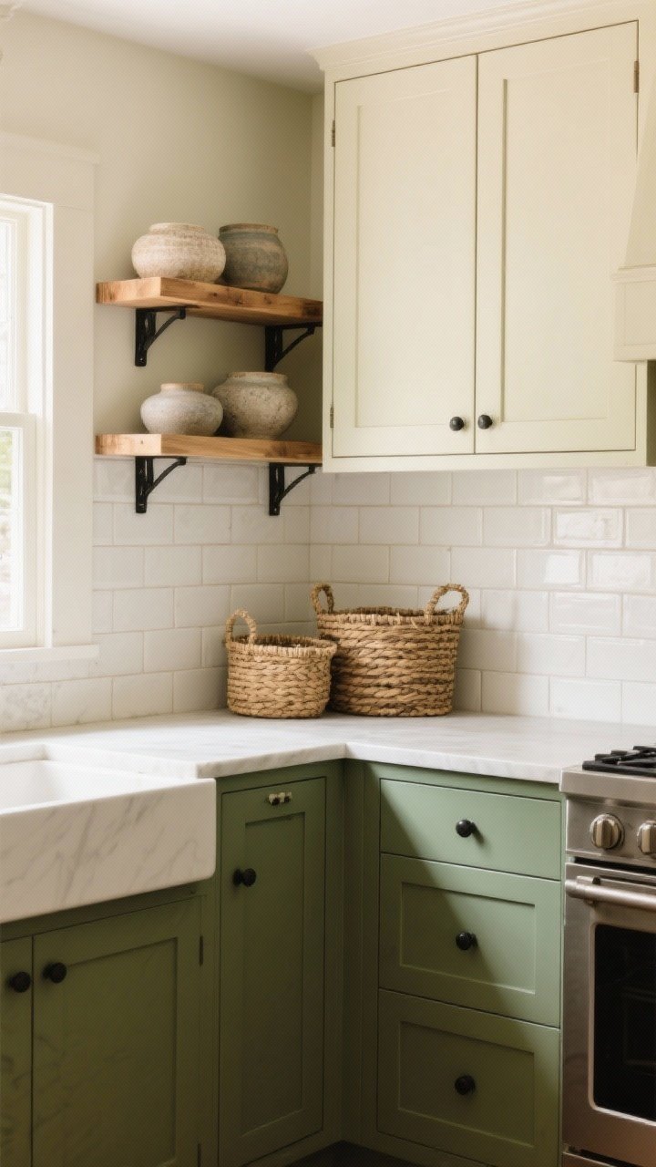
If your kitchen needs a deep breath, this pairing is it. Sage lowers with creamy uppers create a soft, organic vibe that plays nicely with wood, stone, and woven textures.
Why It Works
- Sage is a neutral-adjacent green—it reads natural, not loud.
- Cream keeps things warm and cozy, unlike stark white.
- It’s renter-friendly in spirit: feels high-end without bold risk.
Pro Tips
- Layer with oak shelves and matte black hardware for balance.
- Try a matte finish on the sage to avoid glare and keep the look organic.
- Backsplash: handmade-look subway tile for texture that whispers, not shouts.
3. Black + Wood Grain: Modern Cabin Energy
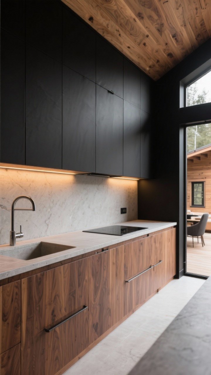
This combo is like a designer cabin moved into the city. Black uppers feel architectural and sleek, while warm wood lowers keep the space grounded and inviting.
Why It Works
- Wood grain stops black from feeling too formal or cold.
- Perfect for open-plan spaces—reads as furniture, not “kitchen-y.”
- Great with concrete counters or honed stone.
Pro Tips
- Choose a wood with visible grain (walnut, white oak) to add texture.
- Keep hardware minimal—integrated pulls or slim bars.
- Lighting: warm LEDs to soften the black and flatter the wood.
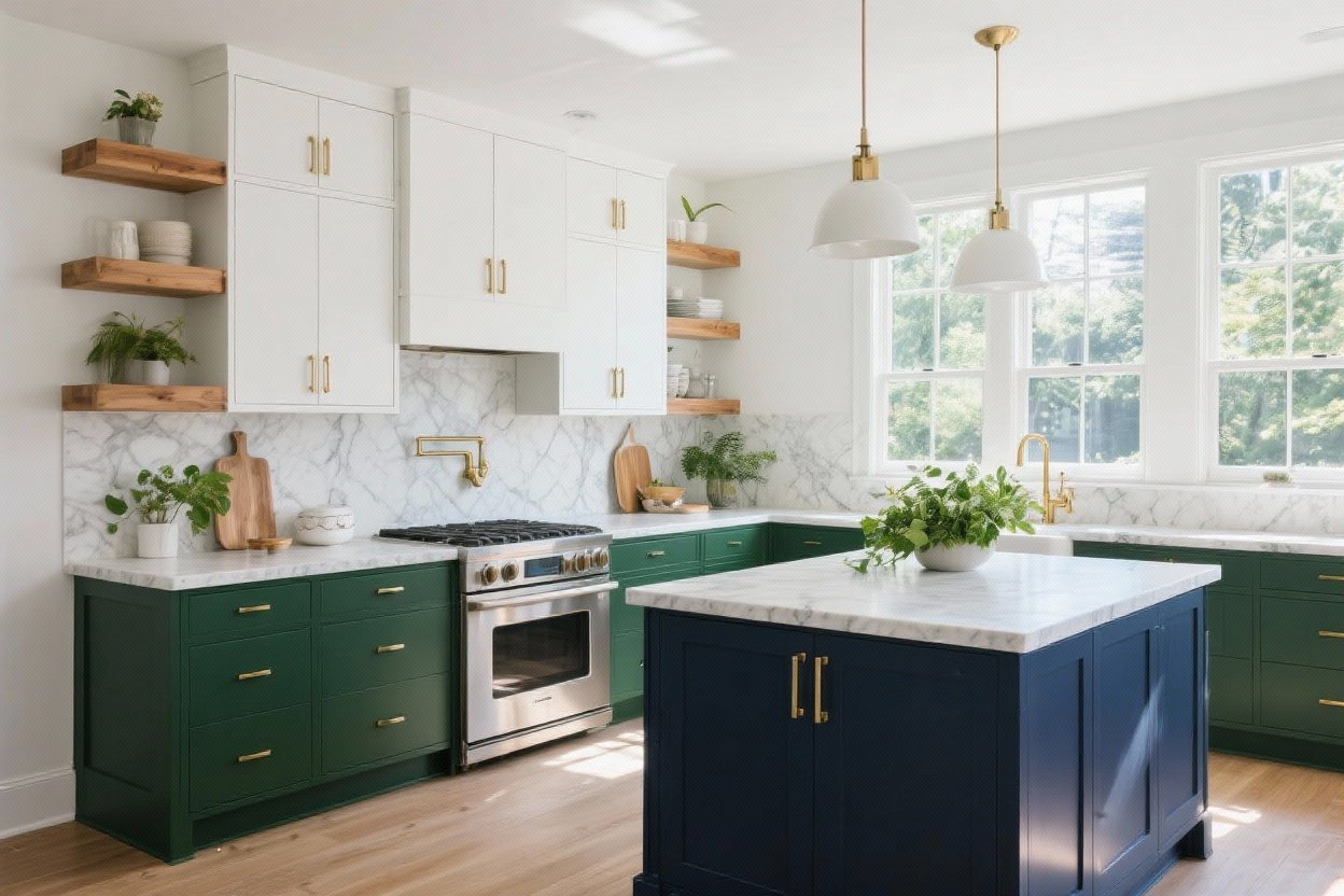
4. Forest Green + Brass Accents: The New Classic
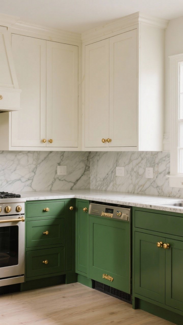
Deep green with polished brass is a match made in design heaven. Do forest lowers and warm white uppers with brass knobs and watch your kitchen go from “fine” to “wow” overnight.
Why It Works
- Forest green feels heritage, not trendy.
- Brass adds jewelry-level shine without being gaudy.
- Pairs beautifully with butcher block or veined stone.
Pro Tips
- Use honed counters for a softer, timeless finish.
- Keep brass finishes consistent—mixing polished and satin can look messy.
- Try a panel-front dishwasher on the green side to keep the look seamless.
5. Warm Gray + Soft White: Clean, Calm, and Rental-Friendly
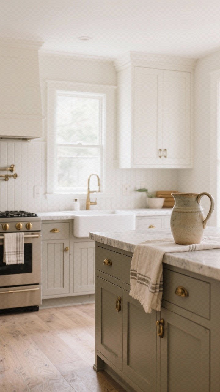
If you want something under-the-radar but still designer-approved, go for warm greige lowers and soft white uppers. It’s clean without veering into sterile, and it plays nice with almost everything you already own.
Why It Works
- Greige adds subtle warmth and sophistication.
- Soft white uppers keep things bright but not stark.
- It’s an easy compromise if you and your partner have different taste, FYI.
Pro Tips
- Test swatches with your flooring undertones—warm floors need warm greige.
- Add texture with beadboard panels on the island for a cottage vibe.
- Hardware: antique brass or brushed nickel both work.
6. Charcoal + Pale Blue: Moody Meets Airy
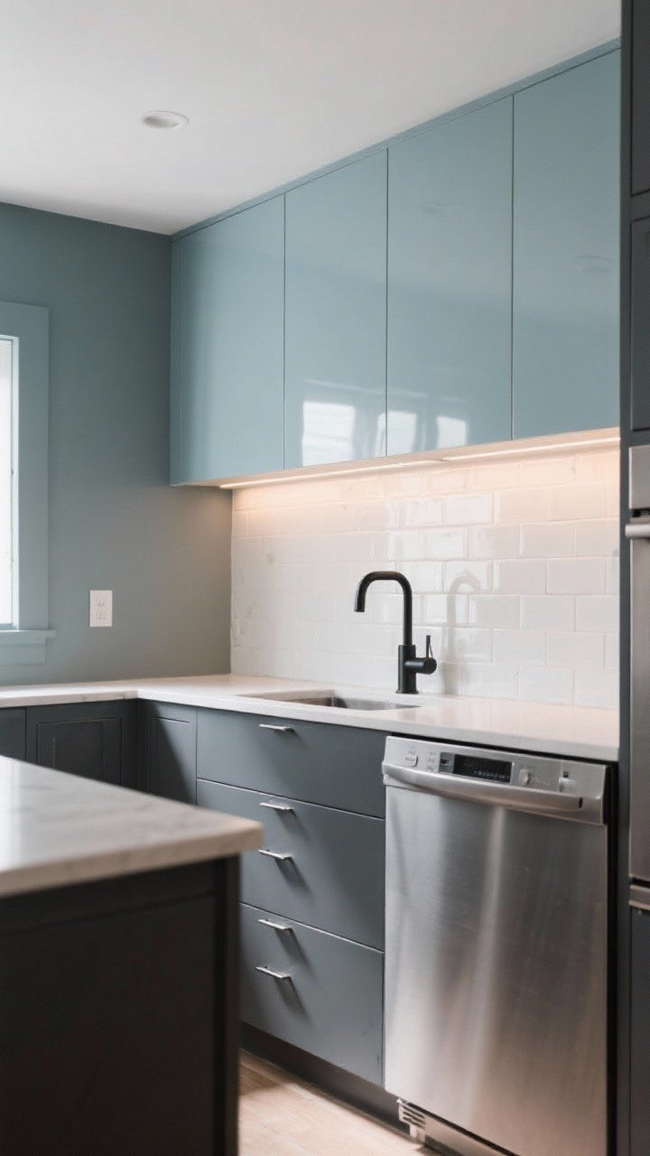
For anyone who wants drama and light in the same room, meet your match. Charcoal lowers anchor the room while pale blue uppers keep it breezy and charming.
Why It Works
- Charcoal is less harsh than black but equally chic.
- Pale blue adds color without commitment.
- Looks especially good with stainless appliances.
Pro Tips
- Pick a gray with warm undertones to avoid a cold, corporate feel.
- Backsplash: glossy white tile to bounce light.
- Try matte black faucets to tie the darker lowers together.
7. Terracotta + Putty Beige: Mediterranean Modern
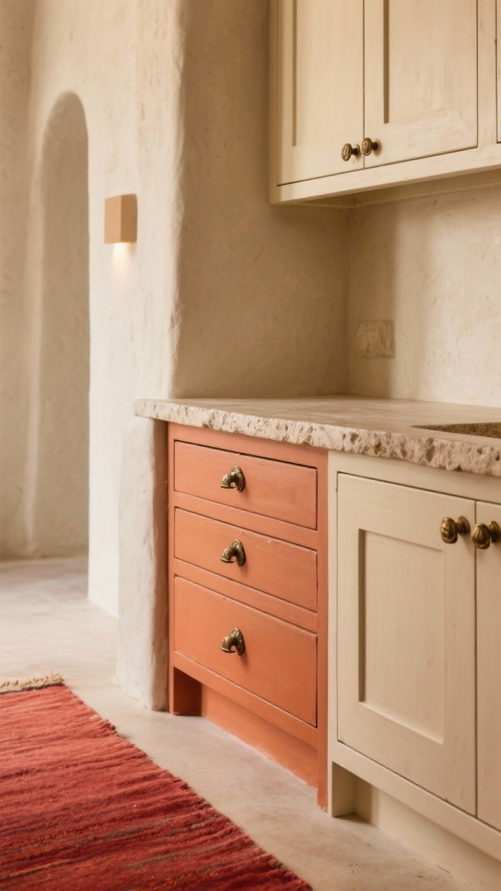
Yes, we’re doing color—but in a grown-up way. Terracotta lowers with putty-beige uppers bring warmth, charisma, and just a hint of vacation energy (without the airport lines).
Why It Works
- Earth tones feel warm and welcoming year-round.
- Putty beige reads as a soft neutral—not yellow, not gray.
- Pairs beautifully with textured stone and natural fibers.
Pro Tips
- Go for limewash or plaster-look walls if you’re feeling extra.
- Hardware: aged brass or oil-rubbed bronze to complement the warmth.
- Add a runner rug with muted reds to pull it together.
8. Black + White, But Make It Textured
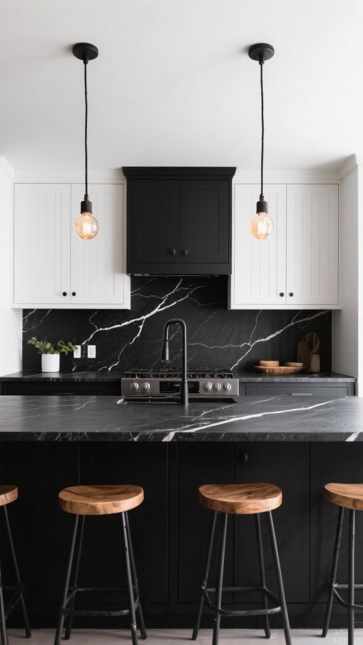
The monochrome duo isn’t new—but the texture makes it fresh. Think matte black lowers with white shiplap uppers or beadboard doors. High contrast, high impact, zero boredom.
Why It Works
- Texture keeps black and white from feeling flat.
- You can go modern, farmhouse, or Scandi—your call.
- Plays nice with wood accents and black-framed windows.
Pro Tips
- Use a low-sheen paint to hide fingerprints on black lowers.
- Consider a black stone slab with white veining to bridge the palette.
- Lighting: warm bulbs to soften contrast and flatter skin tones (yes, it matters).
9. Dusty Rose + Mushroom Taupe: Soft, Subtle, Surprisingly Sophisticated
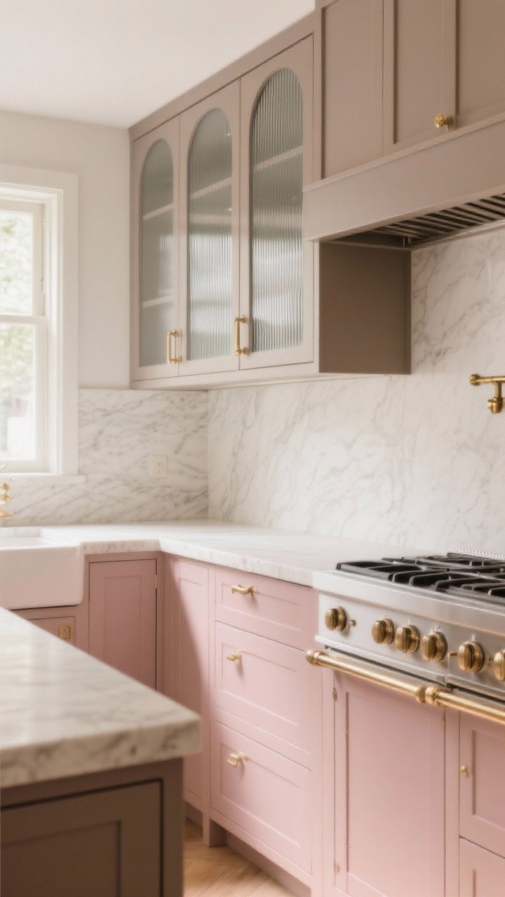
Before you scroll—this is not candy pink. Dusty rose lowers paired with mushroom taupe uppers feel editorial and elevated, especially in small kitchens where bold colors can overwhelm.
Why It Works
- Muted pink reads as a neutral with a pulse.
- Mushroom taupe adds depth without competing.
- Works beautifully with unlacquered brass and creamy stone.
Pro Tips
- Keep the pink muted and dusty, not bubblegum.
- Choose warm-toned counters (no icy whites) to avoid clashing.
- Add ribbed glass uppers if you want something delicate but practical.
10. Deep Teal + Natural Oak: Bold Meets Breezy
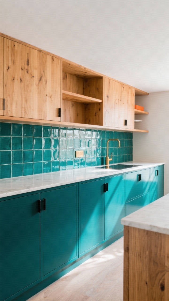
Want color that still feels timeless? Deep teal lowers with natural oak uppers or shelving deliver a rich-but-airy vibe that doesn’t take itself too seriously.
Why It Works
- Teal is a color chameleon—reads green or blue depending on light.
- Oak adds warmth and texture without visual heaviness.
- Perfect for modern, mid-century, or cottage styles.
Pro Tips
- Keep oak finishes light and neutral (avoid orange tones).
- Backsplash: zellige or glossy square tile for dimension.
- Hardware: brushed brass or flat black, depending on mood.
11. Smoky Purple (Eggplant) + Cloud White: Drama With Restraint
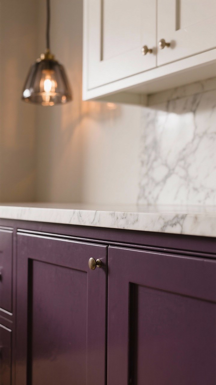
This is for the bold-but-refined crowd. Eggplant lowers bring depth and glamour, while cloud white uppers keep it bright enough for everyday life.
Why It Works
- Eggplant reads moody and sophisticated, not flashy.
- White uppers soften the palette and keep the focus below the counter line.
- Great match with veined marble and vintage rugs.
Pro Tips
- Choose an undertone that skews brown, not red, to feel grown-up.
- Add smoky glass pendants to echo the depth without darkening the room.
- Use semi-gloss on lowers for wipeability without high shine.
12. Soft Black + Putty Green: The Quiet Trendsetter
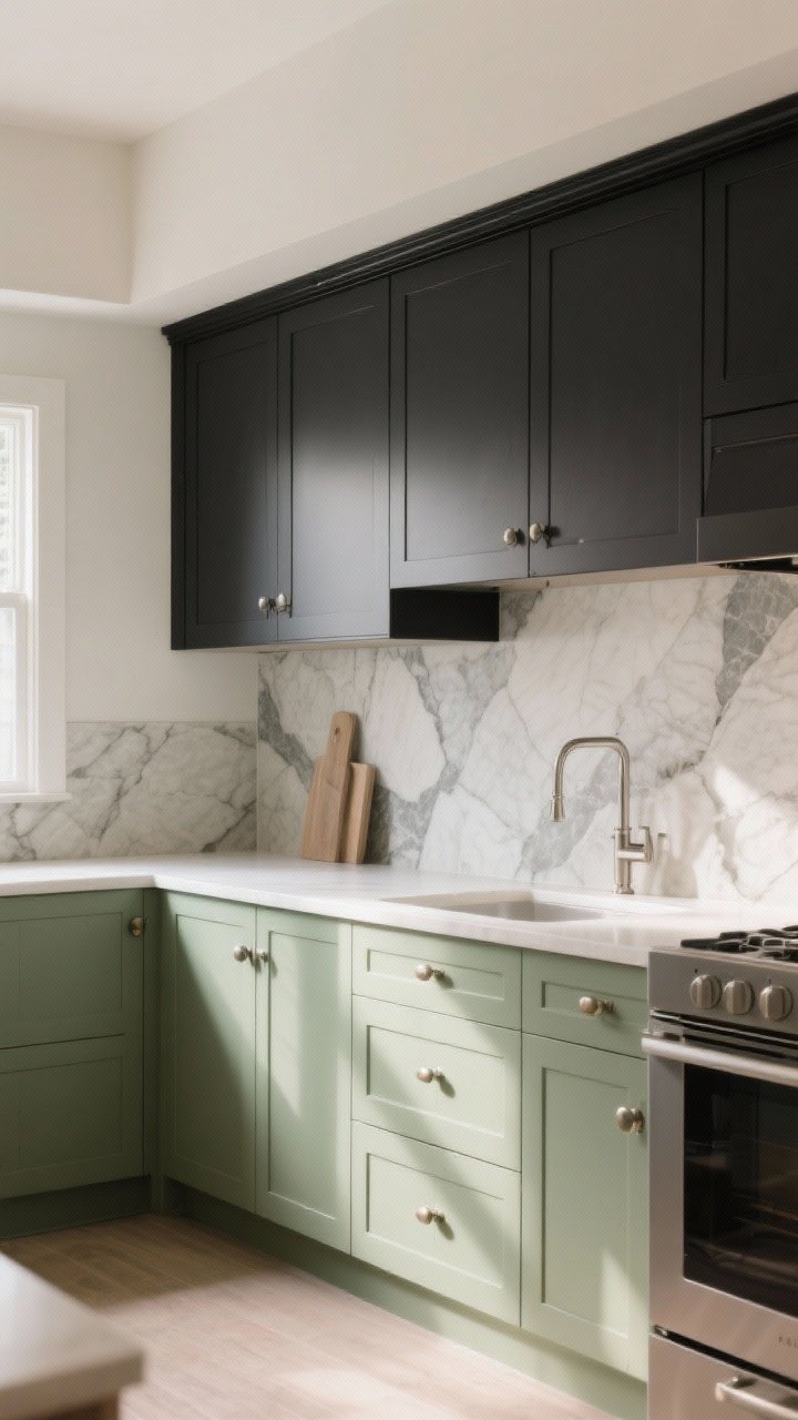
If you’re allergic to basic but still want longevity, try soft black uppers with putty green lowers. It feels tailored and unexpected, like a designer just casually walked through your house.
Why It Works
- Soft black reads charcoal-ink—less harsh, more refined.
- Putty green adds a hint of color that plays like a neutral.
- Looks incredible with stone counters and linear hardware.
Pro Tips
- Mix drawer pulls and knobs to keep things visually interesting.
- Try a stone slab backsplash to tie both tones together.
- Keep wall color warm white or greige to support the palette.
Layout Tricks To Nail Any Two-Tone Combo
- Go darker on the bottom and lighter on top—99% of the time, this is the move.
- Use your island as the accent if you’re nervous. It’s the easiest place to try bolder color.
- Repeat the darker tone in small doses: window trim, a pot rack, or bar stools.
- Mind the undertones. Warm tones like oak and brass want warm paint; cool tones (stainless, blue-gray) want cooler shades.
- Finish matters: matte = modern, satin = forgiving, semi-gloss = scrubbable.
Choosing The Right White (So It Doesn’t Look Weird)
- Warm whites (cream, ivory) work with warm woods, brass, terracotta, and earthy greens.
- Cool whites suit navy, charcoal, stainless steel, and blue-gray stone.
- Test swatches at morning, afternoon, and evening. Light shifts more than you think, IMO.
Hardware + Lighting = The Finishing Touch
- Brass: pairs best with greens, navy, mushroom, terracotta.
- Black: grounds lighter palettes; plays well with oak and white.
- Nickel/Chrome: clean and classic with blue, gray, and white.
- Lighting temperature: 2700K–3000K for warm, welcoming vibes; 3500K if you like a fresher, gallery feel.
Paint Durability Tips
- Use a cabinet-grade enamel or 2K waterborne lacquer for longevity.
- Always sand, prime, and degloss—don’t skip prep unless you love chipping.
- Label and spray doors horizontally if you can. Roller/brush is fine—just use a high-density foam roller for fewer marks.
Sample Palette Starters (Check In Your Light!)
- Navy + White: deep navy, warm white, satin brass
- Sage + Cream: soft sage, cream, matte black
- Black + Wood: soft black, natural oak, brushed steel
- Teal + Oak: rich teal, light oak, aged brass
- Greige + Soft White: warm greige, cloud white, nickel
Two-tone cabinets are the design version of magic: a little sleight of hand and suddenly your kitchen looks taller, brighter, and custom. Start with a pairing that matches your vibe, test a few swatches, and commit. Worst-case scenario? You repaint the island. Best case? Your kitchen becomes the one everyone saves to their inspo folder. You’ve got this.