10 Two Tone Kitchen Cabinet Ideas That’ll Make Your Space Look Designer
Ready to give your kitchen that “Wait, did you hire a designer?” vibe? Two-tone cabinets are the cheat code. They add depth, style, and personality without gut-renovation drama.
Whether you’re into moody elegance or clean modern lines, there’s a combo here that’ll make your space sing.
Let’s dive into 10 ideas that are stylish, practical, and totally doable—even if you’re not painting like Michelangelo on weekends.
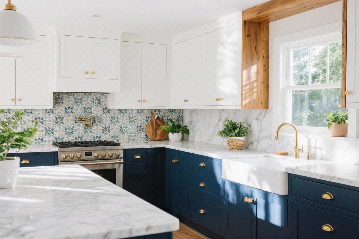
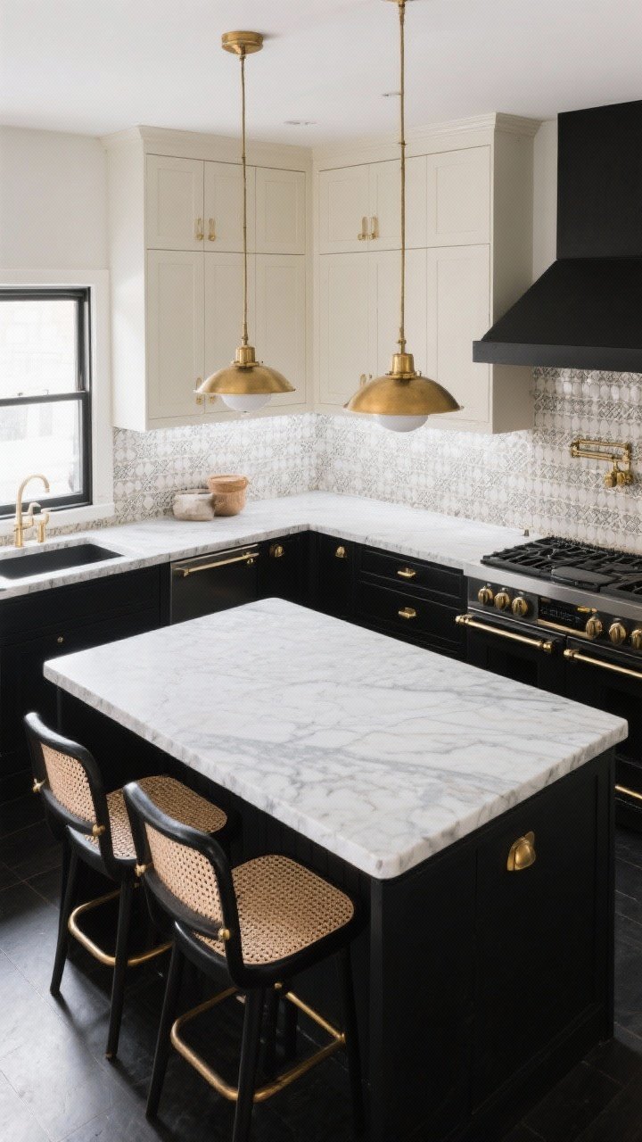
1. Grounded & Airy: Dark Lowers, Light Uppers
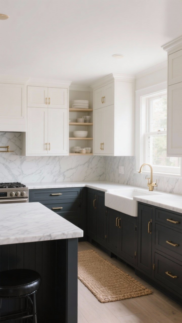
This is the classic two-tone combo for a reason. Dark lower cabinets feel grounded and luxe, while light uppers keep the room open and bright. It’s basically Spanx for your kitchen—snatched but effortless.
Why it works
- Balances visual weight: Dark lowers anchor the room; light uppers keep it from feeling heavy.
- Hides wear and tear: Lower cabinets take more hits. Darker colors hide scuffs like a pro.
Try these palettes
- Charcoal lowers + Warm white uppers
- Navy lowers + Cream uppers
- Forest green lowers + Soft gray uppers
Pro tip: Repeat the darker tone in your island or hardware to pull it together.
2. Island Showstopper: Make the Island the Accent
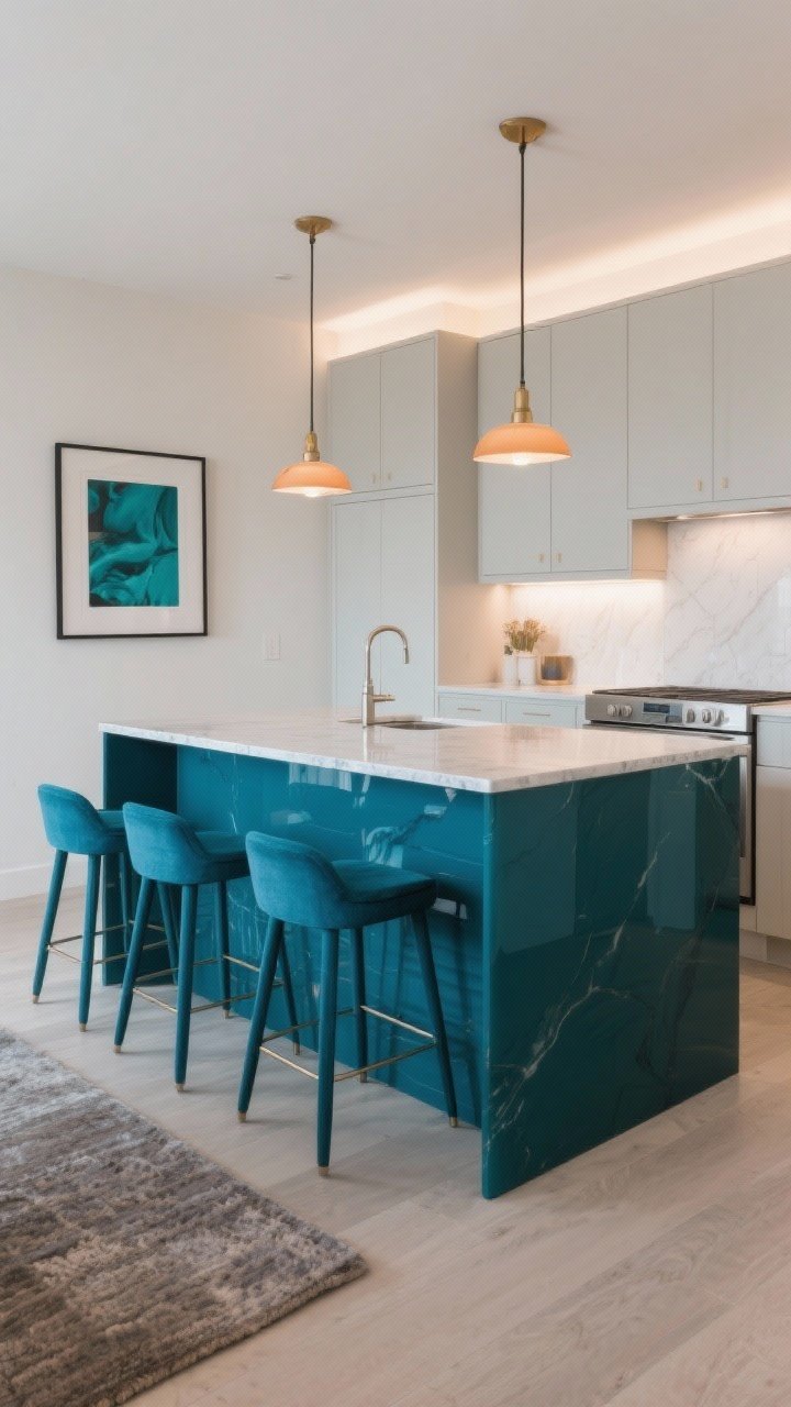
Not ready to paint everything? Make the island the statement. Keep perimeter cabinets neutral and splash the island with a bold color or wood tone. It’s like a fabulous pair of shoes with a classic outfit.
How to nail it
- Contrast just enough: Warm taupe cabinets with a deep teal island? Chef’s kiss.
- Match the vibe: Sleek kitchen? Go glossy. Farmhouse? Try a matte, chalky finish.
- Tie-in: Echo the island color in bar stools, art, or a rug.
Color inspo: Ink blue, olive, black, or walnut wood against soft whites or greiges.
3. Tone-on-Tone Neutrals for Quiet Luxury
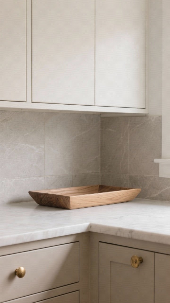
Want it luxe but subtle? Layer two shades of the same neutral family—think mushroom with stone, or greige with cream. It’s minimalist, warm, and very “I shop at artisan markets.”
What to look for
- Undertone harmony: Keep undertones consistent (all warm or all cool) to avoid clashes.
- Texture play: Mix matte paint with satin or wood to add depth.
Winning combos: Putty lowers + Linen uppers, Stone gray lowers + Off-white uppers.
4. Wood + Paint: The Best of Both Worlds
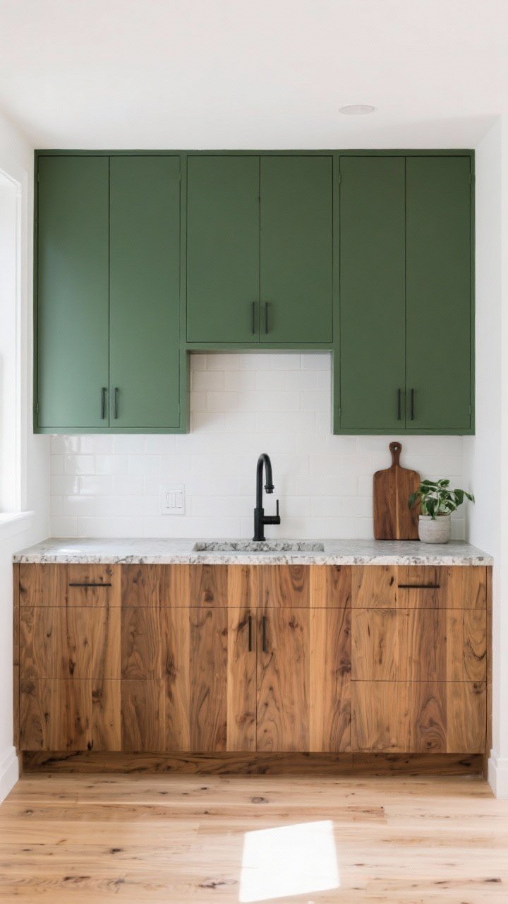
Pairing natural wood with painted cabinets is the two-tone power move. You get warmth from the wood and crispness from the paint. It’s cozy-meets-modern—AKA the sweet spot.
How to mix wood tones
- Keep the grain clean: Rift-sawn oak or walnut feels high-end and timeless.
- Balance with paint: White, deep green, or charcoal plays beautifully with medium woods.
- Mind the floors: If you have wood floors, choose a different tone for contrast.
Idea: Wood lowers + painted uppers for warmth without heaviness.
5. Split by Zone: Prep vs. Display
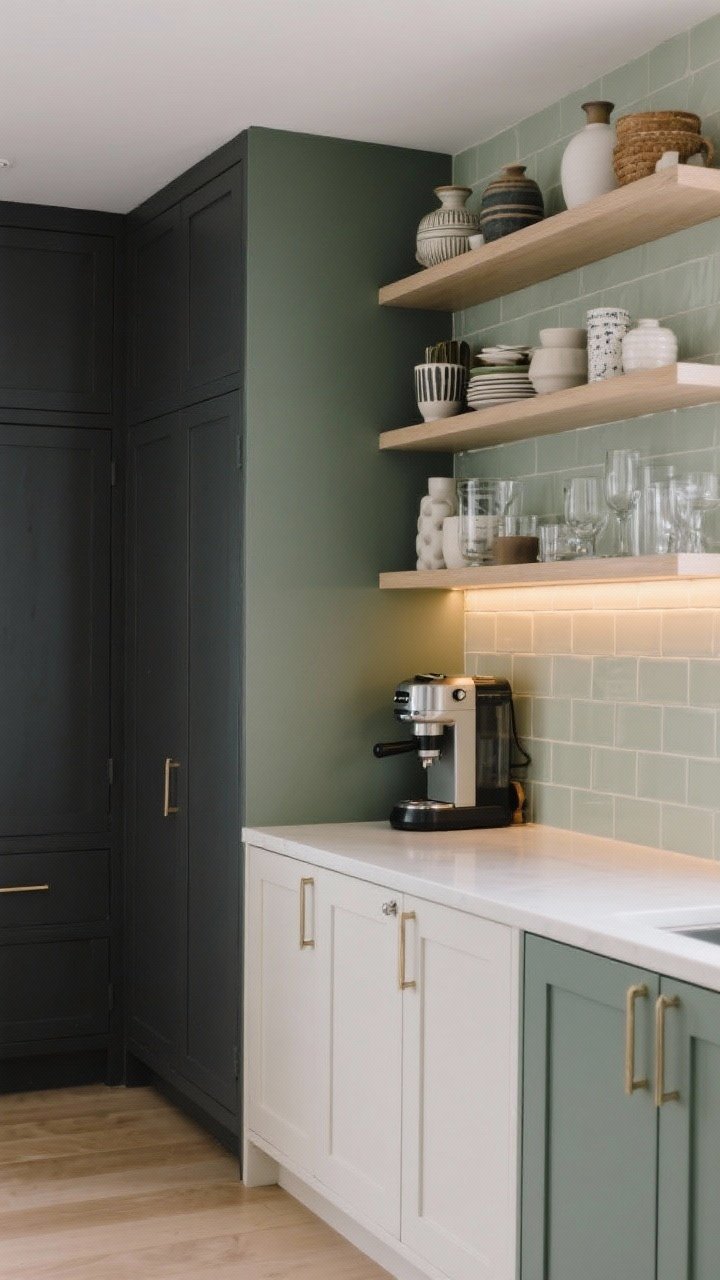
Who says the split has to be top and bottom? Try dividing by function. Paint the “work zone” one color and the “display zone” another to visually organize the space.
Where to use it
- Pantry/utility wall: Go darker for drama and durability.
- Open shelving area: Keep it light so your ceramics and glassware shine.
- Coffee bar: Give it its own color moment. Because caffeine deserves respect.
Tip: Repeat the lighter color on the backsplash to connect zones.
6. High Contrast Monochrome: Black + White Done Right
Black and white is bold, timeless, and surprisingly easy. The trick is softer finishes so it doesn’t feel like a chessboard exploded in your kitchen.
Make it livable
- Use warm whites: Slightly creamy whites soften stark contrast.
- Add texture: Honed stone, zellige tiles, woven stools, or brass hardware warm it up.
- Flip the script: Black uppers can work if you’ve got great lighting and a light backsplash.
FYI: Matte black is more forgiving than glossy for fingerprints and smudges.
7. Color Dipped: Just the Bottom Row (Or Just the Uppers)
Want something playful but not too loud? Try a colored band. Paint the bottom row or the uppers only for a crisp, modern graphic look.
Best for
- Smaller kitchens: Keeps things light while still adding personality.
- Gallery walls: If you’ve got open shelves, make the uppers the accent for a curated feel.
Palette ideas
- Sage lowers + Clean white uppers
- Dusty blue uppers + Warm putty lowers
- Terracotta lowers + Cream uppers
Pro tip: Match your wall color to the uppers to make them “disappear.”
8. Frame It Out: Contrasting Frames and Doors
Want a more custom, designer vibe? Keep the cabinet frames one color and paint the doors another. It’s subtle but chic—like piping on a couture jacket.
How to execute
- Inset or shaker doors: These styles show off contrasting frames beautifully.
- Stick to two colors: Keep it classic—don’t add a third tone unless it’s hardware or wood.
- Consider glass fronts: Painted frames with glass doors elevate the look.
Color combos: Ivory frames + Greige doors, Black frames + Walnut doors.
9. Go Moody With Jewel Tones (Balanced by Neutrals)
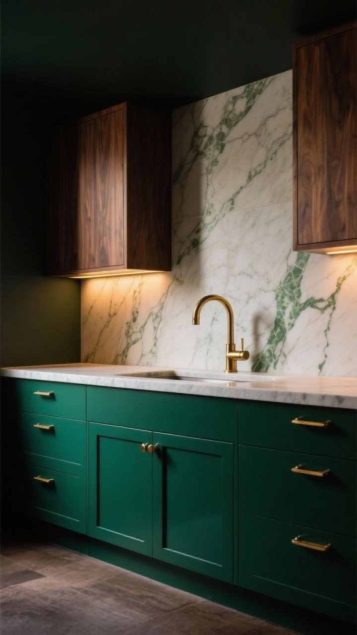
If you’re drama-friendly, lean into gemstones: emerald, sapphire, aubergine. Balance them with lighter uppers or natural wood so it feels rich, not cave-like.
Make it feel cohesive
- Soft lighting: Warm LEDs keep jewel tones from reading harsh.
- Stone selection: Veined marble or quartz with faint complementary colors ties everything in.
- Hardware: Brass or black looks incredible against saturated paint.
IMO: Deep green + walnut + unlacquered brass is forever. No notes.
10. Two Textures, One Color Family
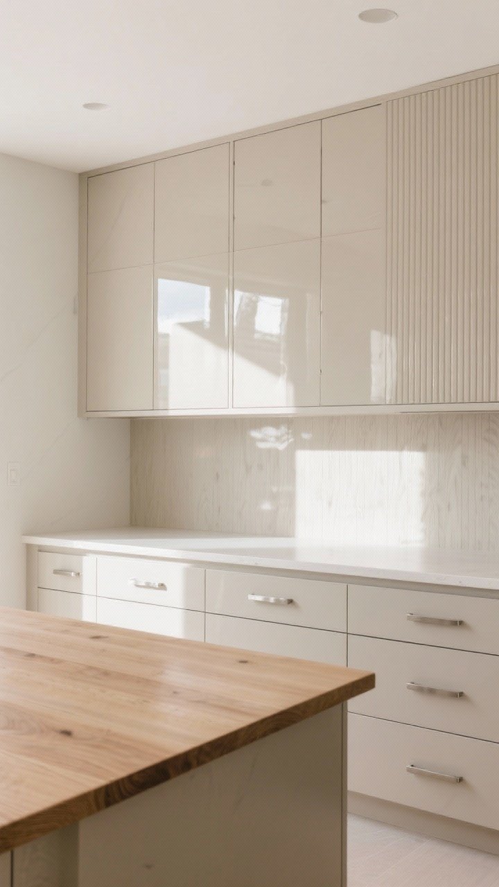
Two-tone doesn’t have to mean two colors. Try the same color family in different textures—like matte paint with glossy lacquer, or painted lowers with fluted wood uppers. It’s subtle, modern, and high-impact in person.
Texture mix ideas
- Matte lowers + High-gloss uppers: Sleek, contemporary, and easy to wipe down.
- Painted cabinets + Slab wood island: Adds warmth without visual clutter.
- Fluted doors + Smooth drawers: Just enough detail to feel custom.
Tip: Keep hardware consistent so the textures can shine.
Paint and Finish Tips
- Sheen matters: Satin or semi-gloss is durable and light-reflective. Matte looks gorgeous but shows marks.
- Sample big: Paint poster boards and move them around your kitchen throughout the day.
- Undertones are everything: If your counters are warm, avoid icy whites. If your floors are cool, skip overly yellow creams.
- Hardware coordination: Mix metals sparingly. One primary finish + one accent keeps it intentional.
Layout and Proportion Cheats
- Small kitchen? Put darker colors low or on the island only to keep it spacious.
- Tall ceilings? You can handle darker uppers—just add bright backsplash and lighting.
- Open concept? Repeat one tone in the adjacent room (console table, frames, textiles).
DIY vs. Pro: What’s Worth It
- DIY-friendly: Islands, uppers only, or swapping door fronts.
- Call a pro for: Lacquer finishes, spraying frames in place, or color-matching to existing wood.
- Budget hack: Replace just the doors and drawer fronts; paint the frames.
Lighting: The Secret Sauce
- Under-cabinet LED strips: Make dark lowers look intentional, not shadowy.
- Warm bulbs (2700–3000K): Flatter to paint and skin tone—yes, it matters.
- Statement pendants: Echo the accent color or metal for cohesion.
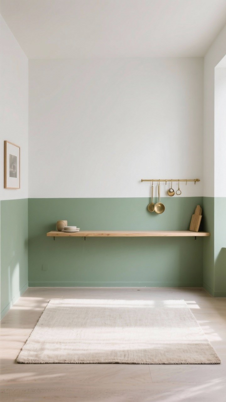
Backsplash + Counter Pairings
- Marble-look quartz: Soft veins bridge two cabinet tones beautifully.
- Zellige or handmade tile: Adds movement and texture, especially with neutrals.
- Butcher block: Warms up monochrome or black-and-white schemes.
Color Palettes to Steal
- Coastal calm: Fog gray lowers + Cloud white uppers + Brushed nickel hardware.
- Modern classic: Ink blue island + Soft white perimeters + Brass hardware.
- Organic luxe: Rift oak lowers + Alabaster uppers + Honed limestone counters.
- Moody chic: Charcoal lowers + Putty uppers + Aged brass + Veined quartz.
Maintenance Reality Check
- Dark colors: Hide scuffs but show dust and grease. Keep microfiber cloths nearby.
- Light colors: Show grime faster but clean easily. Magic erasers are a blessing.
- Wood: Use gentle cleaners and avoid standing water near sinks and dishwashers.
Two-tone cabinets aren’t just a trend—they’re a strategy. They let you shape how your kitchen feels: lighter, taller, cozier, or sleeker. Start with one accent (the island, the lowers, or a single zone), test your colors in real light, and go from there. You’ve got this—your kitchen glow-up is officially on.