12 Exterior Color Palette Ideas That Instantly Boost Curb Appeal
Your home’s exterior is basically its outfit. And just like a killer blazer or the right sneakers, the right color palette can make everything look intentional, expensive, and put-together. The trick? Balancing contrast, undertones, and texture so your house looks “designer” without trying too hard.
Below are 12 exterior color palette ideas that actually work in the real world—no filter required. We’re talking front doors that pop, trim that frames like a perfect cat-eye, and siding that hides dirt (bless). Let’s pick your house’s best look.
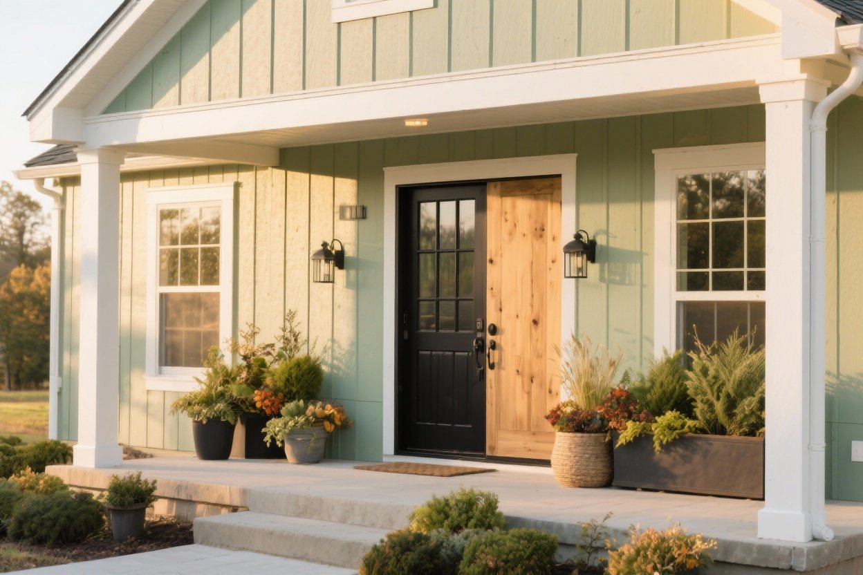
1. Soft Greige + Crisp White + Black Accents
Greige (that magical gray-beige) is a crowd-pleaser for a reason. It plays well with stone, brick, and landscaping—and it hides dust like a champ. Add bright white trim for contrast and black accents on the door, railings, or light fixtures to sharpen the whole look.
Why It Works
- Greige feels warm but modern; no cold concrete vibes.
- Black accents create a clean outline and pull the eye to the entry.
- White trim makes windows look bigger and more expensive.
Tips
- Pick a greige with a neutral or slightly warm undertone to avoid purple or green casts.
- Use a satin finish on doors and a matte/eggshell on siding to minimize glare.
2. Charcoal Siding + Warm Wood + Brushed Brass
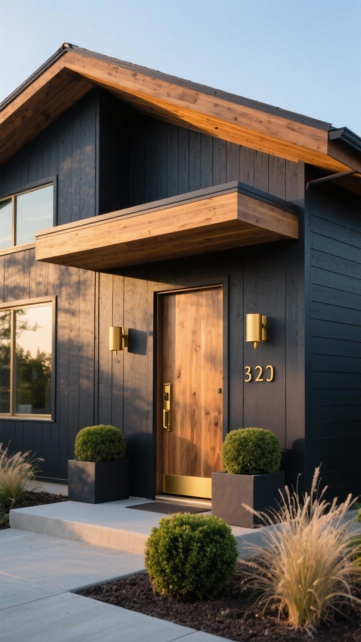
Want your home to look like it belongs on a design blog? Go dark charcoal on the siding, add warm wood for the soffit or porch, and sprinkle in brushed brass or bronze hardware. It’s moody but welcoming—like a little black dress with gold jewelry.
Why It Works
- High contrast gives a modern, tailored feel without feeling stark.
- Wood brings warmth and softens the darker hue.
- Brass hardware elevates the overall look instantly.
Tips
- Choose charcoal with a blue or neutral base for a clean look; avoid green undertones near heavy foliage.
- Keep landscaping clean—boxwoods or grasses look sculptural against dark siding.
3. Coastal White + Sky Blue Door + Weathered Gray Shingles
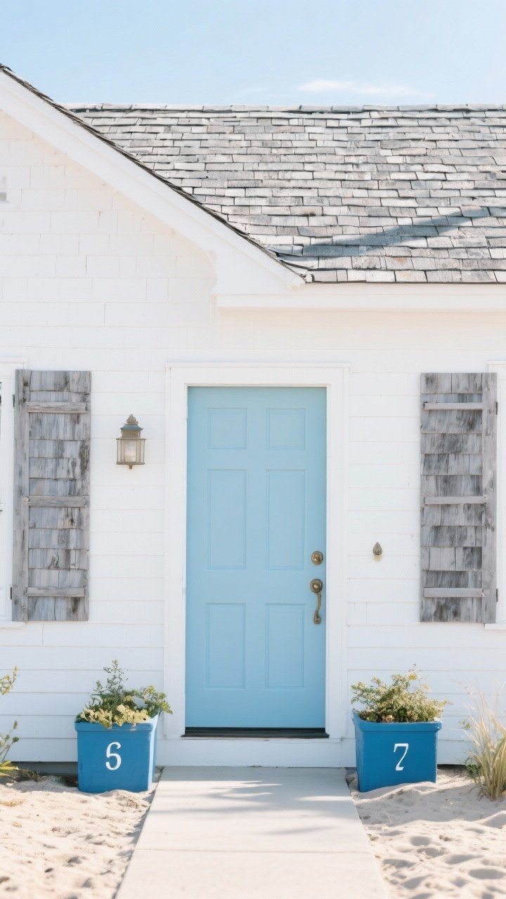
Light, airy, and beachy—even if you’re landlocked. A clean white exterior paired with weathered gray shakes or roof and a soft sky-blue door screams effortless summer all year.
Why It Works
- White reflects light and looks fresh, not sterile, when balanced with texture.
- Gray shingles add subtle depth and hide wear.
- Blue door gives a hit of personality without overpowering.
Tips
- Go for a slightly warm white exterior to avoid harshness.
- Repeat the blue on planters or house numbers for cohesion.
4. Sage Green + Cream Trim + Copper Details
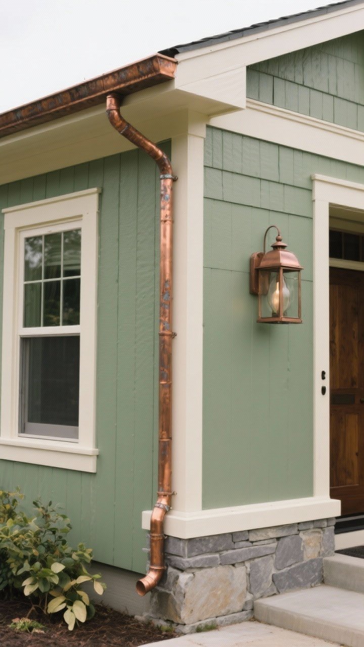
This palette loves nature. Sage green siding with creamy trim and copper accents (gutters, lights) blends into a lush landscape without feeling dull. It’s classic, but not basic.
Why It Works
- Sage reads calm and sophisticated—great with stone or brick.
- Cream feels softer than bright white and flatters green.
- Copper patinas over time, adding character and depth.
Tips
- Choose a sage with a gray base to keep it modern.
- Seal copper if you want it shiny; otherwise, embrace the patina.
5. Modern Farmhouse: Warm White + Matte Black + Natural Wood
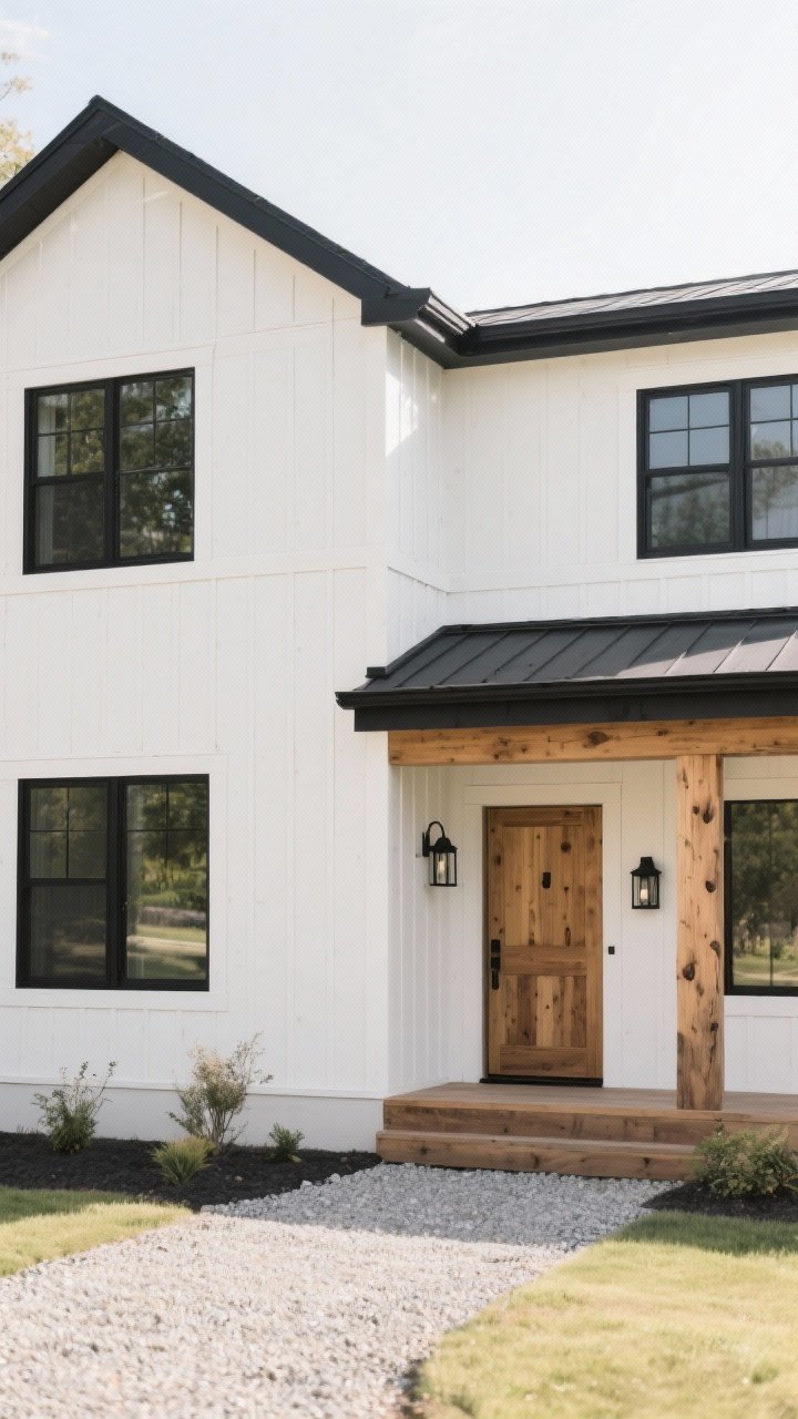
If you’re into clean lines with a little rustic charm, this is your go-to. Warm white siding, matte black windows/trim, and a wood door or porch beam give instant farmhouse vibes—minus the kitsch.
Why It Works
- Black frames punctuate the white and define the architecture.
- Wood tones keep it cozy and grounded.
- Super versatile—works in suburban and rural settings.
Tips
- Pick a white with a soft cream undertone to avoid stark contrast in full sun.
- Keep black finishes matte for a luxe, non-reflective look.
6. Terracotta Stucco + Deep Olive Trim + Aged Bronze

Channel a Mediterranean villa with warm terracotta or clay-toned stucco, deep olive trim, and aged bronze fixtures. It’s earthy, timeless, and insanely flattering in bright light.
Why It Works
- Terracotta glows at golden hour (yes, your house can have good lighting).
- Olive adds depth without feeling stark against warm walls.
- Bronze ties the palette together with rich, old-world charm.
Tips
- Use a limewash or mineral paint for breathable stucco finishes.
- Add patterned tile at the entry for a chef’s-kiss finishing move.
7. Slate Blue Siding + Bright White Trim + Red Front Door

If you love classic Americana with a twist, try slate blue siding. Paired with crisp white trim and a confident red door, it reads traditional but fresh—like Cape Cod went to fashion school.
Why It Works
- Slate blue feels calm and sophisticated—not nautical literal.
- White keeps the palette snappy and clean.
- Red is a focal point that screams “Welcome!” without yelling.
Tips
- Choose a muted red (brick, cranberry) for elegance.
- Repeat the red in a mailbox or outdoor rug so it doesn’t feel random.
8. Mushroom Taupe + Stone Gray + Iron Black
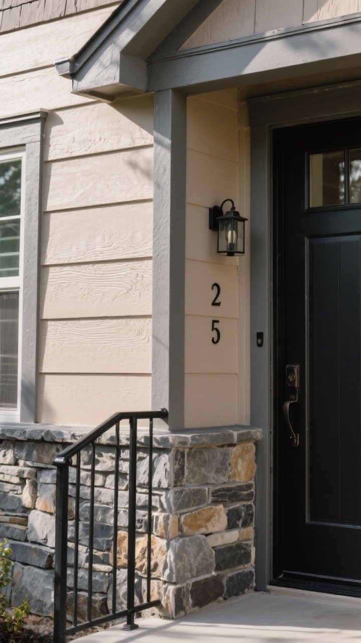
Neutrals, but make them chic. A mushroom taupe body with stone-gray trim and iron black accents creates a layered, custom look that quietly whispers, “This house was planned.”
Why It Works
- Mushroom tones are forgiving in different light conditions.
- Gray trim adds dimension without big contrast jumps.
- Iron black on railings, lights, or numbers gives structure.
Tips
- Test in sun and shade—taupe can shift warm or cool quickly.
- Use textured siding or stone to keep the palette from going flat.
9. Forest Green + Putty Trim + Polished Nickel
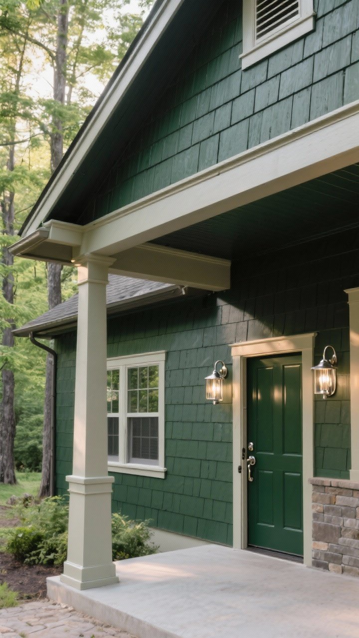
For wooded lots or craftsman homes, deep forest green with putty/greige trim looks tailored and organic. Add polished nickel fixtures for a little sparkle that doesn’t fight the greenery.
Why It Works
- Green blends with the landscape without disappearing.
- Putty trim reads upscale and soft next to saturated colors.
- Nickel keeps it bright but not flashy.
Tips
- Choose a green with black or gray undertones for sophistication.
- Consider a glossier front door finish for subtle contrast.
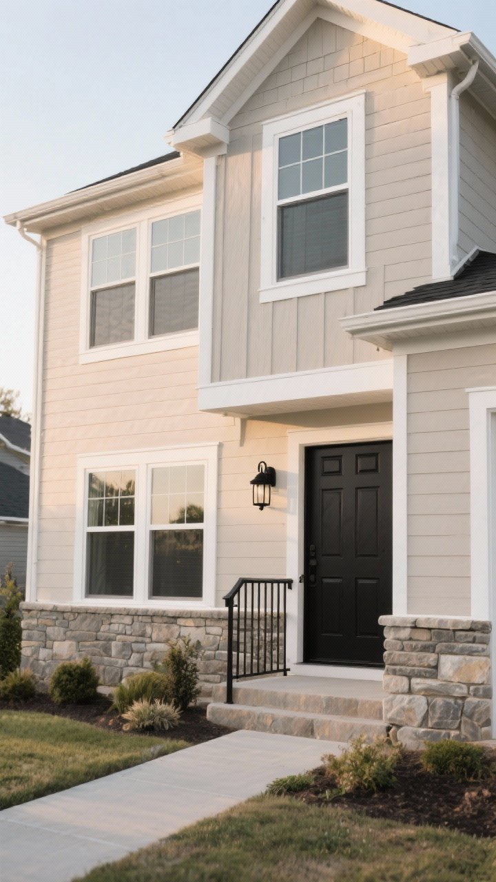
10. All-Black Exterior + Natural Stone + Warm White Windows
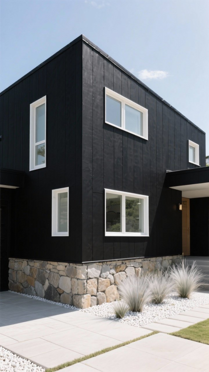
Bold? Yes. Risky? Less than you think. An all-black exterior paired with natural stone and warm white window frames looks contemporary and dramatic, especially on simple forms.
Why It Works
- Black flattens visual noise and highlights architecture.
- Stone breaks up the mass and adds organic texture.
- Warm white windows pop without looking stark.
Tips
- Use high-quality, UV-stable paint to avoid fading.
- Balance with light landscaping—silver grasses, pale pavers, or white gravel.
11. Buttercream Yellow + White Trim + Navy Shutters
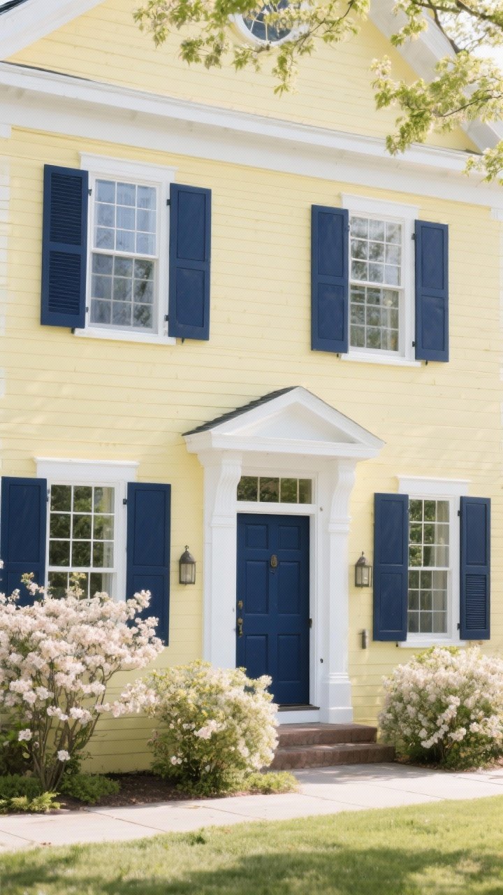
Cheerful without going cartoonish, buttercream yellow brings sunshine to traditional façades. Pair with white trim and navy shutters for a preppy, timeless combo that looks amazing in spring blooms.
Why It Works
- Soft yellow lifts the mood but stays refined.
- Navy grounds the palette and plays well with brick or stone.
- White trim keeps everything fresh and bright.
Tips
- Keep the yellow pale and creamy—avoid school-bus vibes, please.
- Match the navy to your front door for unity.
12. Monochrome Warm Gray Layers + Textured Wood + Black Lighting
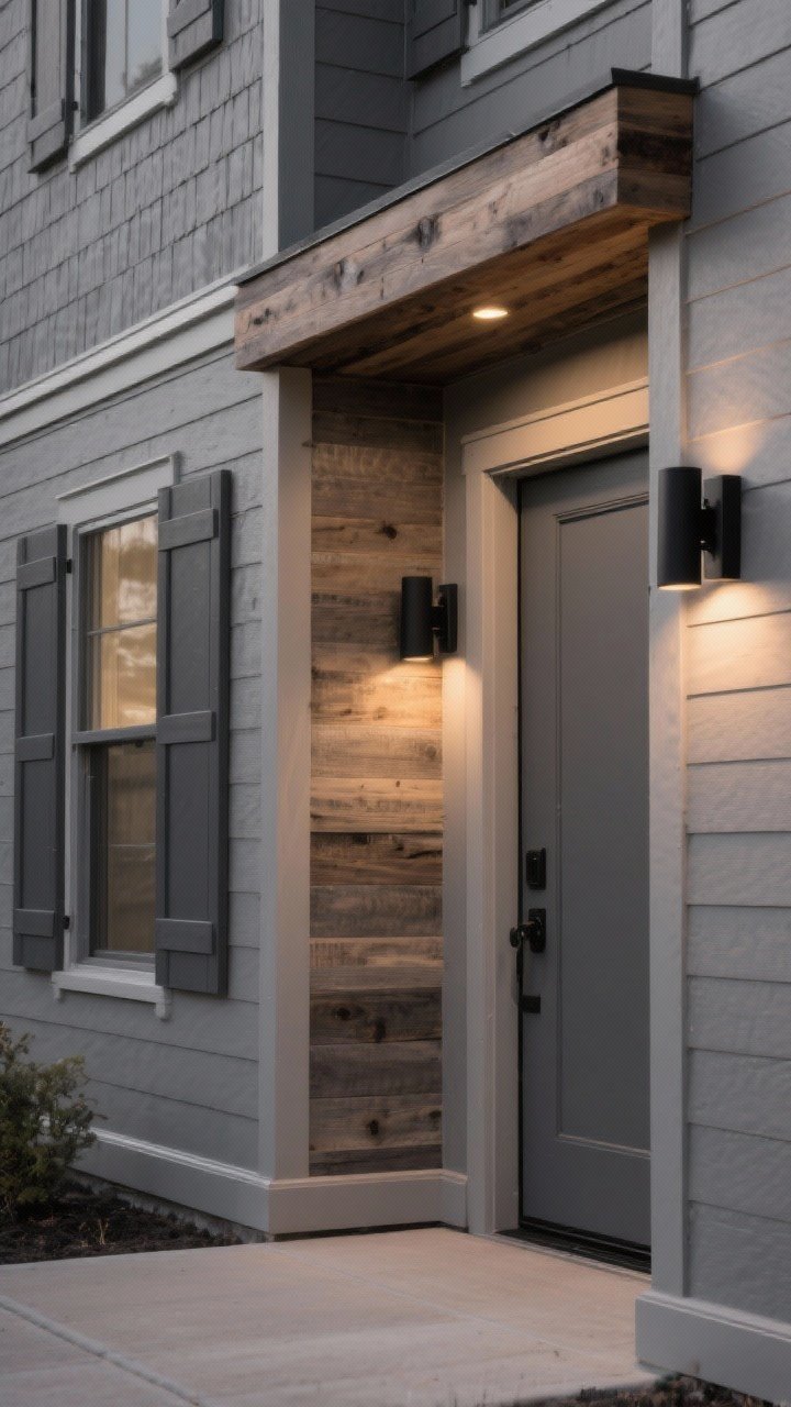
For a subtle, high-end look, layer warm grays in different strengths: mid-tone for siding, lighter gray for trim, deeper gray for shutters. Add textured wood accents and sleek black lighting for contrast and polish.
Why It Works
- Monochrome feels cohesive and curated—no jarring transitions.
- Wood introduces a tactile note that keeps things from feeling flat.
- Black lighting punctuates the palette and frames entries.
Tips
- Stick to one warm/cool family across all grays to avoid clashing.
- Vary finishes: matte siding, satin door, and semi-gloss trim for depth.
Pro Moves For Any Palette
- Sample Big: Paint at least 2×3 ft swatches on different sides of the house and live with them for a week. Light changes everything.
- Mind Undertones: If your roof is warm brown, choose warm-based paints. Cool roof? Cool paints. Easy.
- Coordinate With Hardscapes: Don’t fight your stone, brick, or pavers—echo their undertones.
- Finish Matters: Flat/eggshell for siding (hides imperfections), satin/semi-gloss for trim and doors (durable, wipeable).
- Front Door Freedom: The door can be 10–20% bolder than the rest. It’s the jewelry.
- Hardware + Lighting: Keep metals consistent. Mixing can work indoors; outside, it often reads messy.
FYI: Climate + Maintenance
- Hot, sunny climates: Lighter colors resist fading and reduce heat absorption.
- Humid/coastal areas: Look for mildew-resistant formulas and wash-friendly finishes.
- Dusty regions: Mid-tones like greige, taupe, and slate hide grime better than bright white.
Quick Palette Starters (No Guesswork)
- Neutral Classic: Greige body, white trim, black door, nickel hardware.
- Modern Statement: Charcoal body, wood door, brass lights, black windows.
- Nature Blend: Sage body, cream trim, copper lights, stone walkway.
- Coastal Fresh: White body, gray roof, sky-blue door, polished chrome.
At the end of the day, your home should feel like you—just slightly more photogenic. Pick a palette that works with what you’ve got (roof, brick, landscaping), sample generously, and trust your gut. You’ve got this—and your curb will thank you.