12 Living Room Paint Color Ideas That Instantly Upgrade Your Space
Ready to make your living room look like you hired a designer—without actually hiring a designer? Paint is your quickest, smartest move.
The right shade can make a tiny room feel bigger, add drama, or calm everything down so you can finally relax.
Let’s dive into 12 paint color ideas that actually work in real homes (like yours), with zero fluff.
1. Soft Greige: The Effortless Neutral That Never Fails
Can’t decide between gray and beige? Greige is your peacemaker. It’s warm enough to feel cozy but crisp enough to look modern. It also plays nicely with pretty much any furniture style—Scandi, farmhouse, mid-century, you name it.
Why It Works
- Balances light: Doesn’t turn blue in shade or yellow in afternoon sun.
- Ultra-versatile: Warm undertones flatter wood tones and leather; cooler ones suit chrome and glass.
Pro Tips
- Try shades like Benjamin Moore Revere Pewter or Sherwin-Williams Agreeable Gray.
- Pair with black accents (frames, lamps) to keep it from feeling too “builder basic.”
- Test large swatches on all walls. Greige shifts wildly with light.
2. Moody Navy: Dramatic, Elegant, Not-Too-Serious
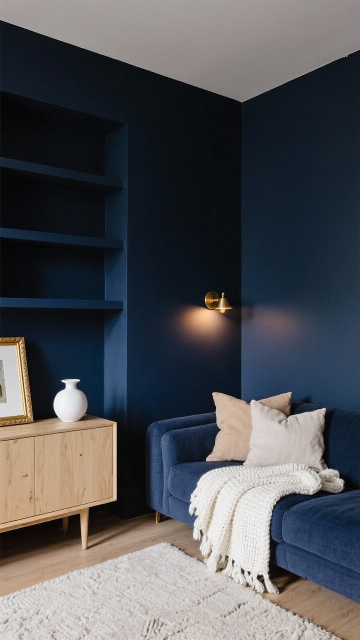
If you want your living room to feel like a hug, go navy. It’s dramatic without being moody-teenager dramatic. It makes light wood, brass, and white pop in the best way.
Why It Works
- Instant depth: Makes rooms feel tailored and high-end.
- Great for accent walls: Try behind a sofa or on built-ins.
Pro Tips
- Look for inky navies like Hale Navy or Stiffkey Blue.
- Use matte or eggshell to avoid glare; add warm lighting so it doesn’t read black at night.
- Balance with lighter textiles: ivory knits, natural linen, pale rugs.
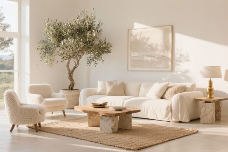
3. Warm White: Airy, Fresh, Never Sterile
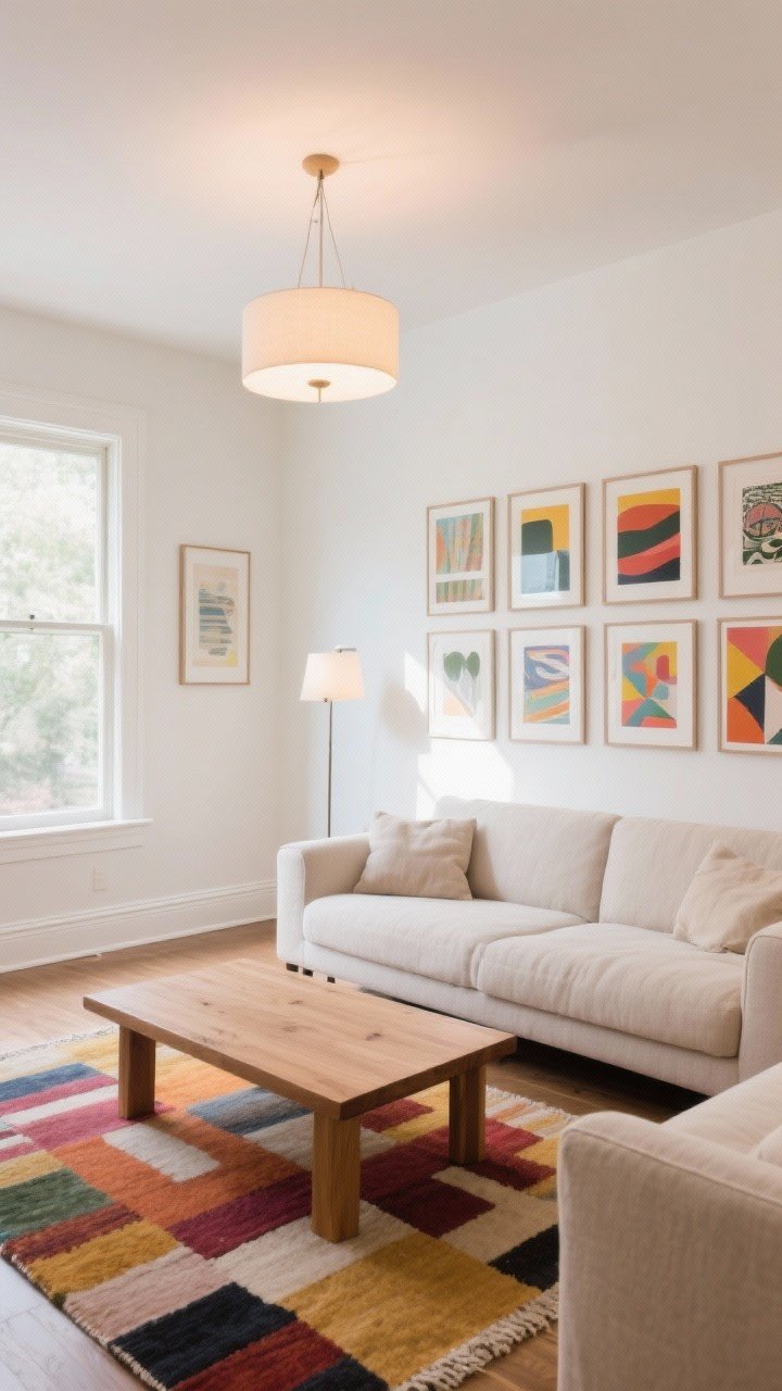
Not all whites are created equal—some are colder than your ex. Go **warm white** for a clean look that still feels welcoming. It’s also perfect if you love art and statement rugs.
Why It Works
- Brightens dark spaces with limited natural light.
- Gallery vibe: Lets your decor be the star.
Pro Tips
- Favorites: Swiss Coffee, White Dove, Alabaster.
- Check trims: Use a slightly crisper white on baseboards for subtle contrast.
- Avoid cool bulbs—choose 2700–3000K for soft warmth.
4. Earthy Olive Green: Cozy, Organic, Unfussy
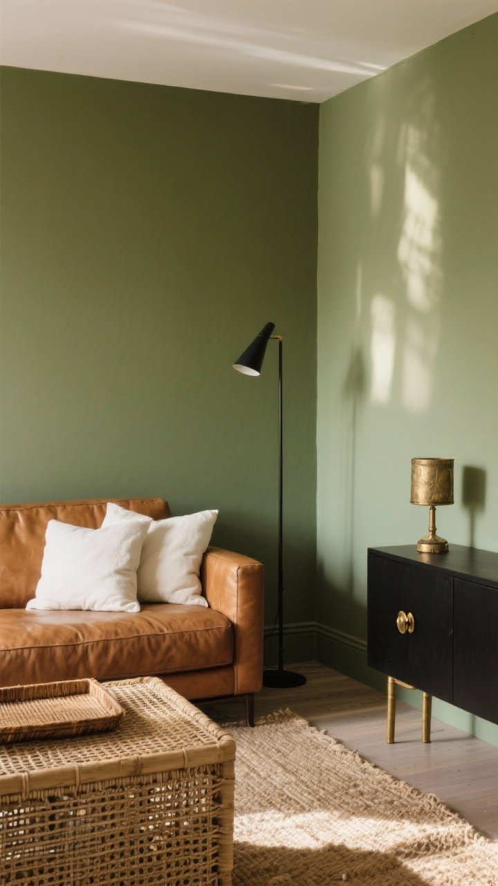
If your Pinterest board screams “plants and pottery,” olive green might be your soulmate. It brings a soft, natural vibe without feeling too cottagecore.
Why It Works
- Grounded and calming: Pairs beautifully with tan leather and woven textures.
- Hides scuffs: A real perk if your living room is a high-traffic zone.
Pro Tips
- Go muted: Rookwood Sash Green or Clary Sage keep it sophisticated.
- Layer with cream and black accents for contrast.
- Bring in brass or aged gold hardware to warm it up.
5. Dusty Blush: Soft, Chic, And Not Just For Nurseries
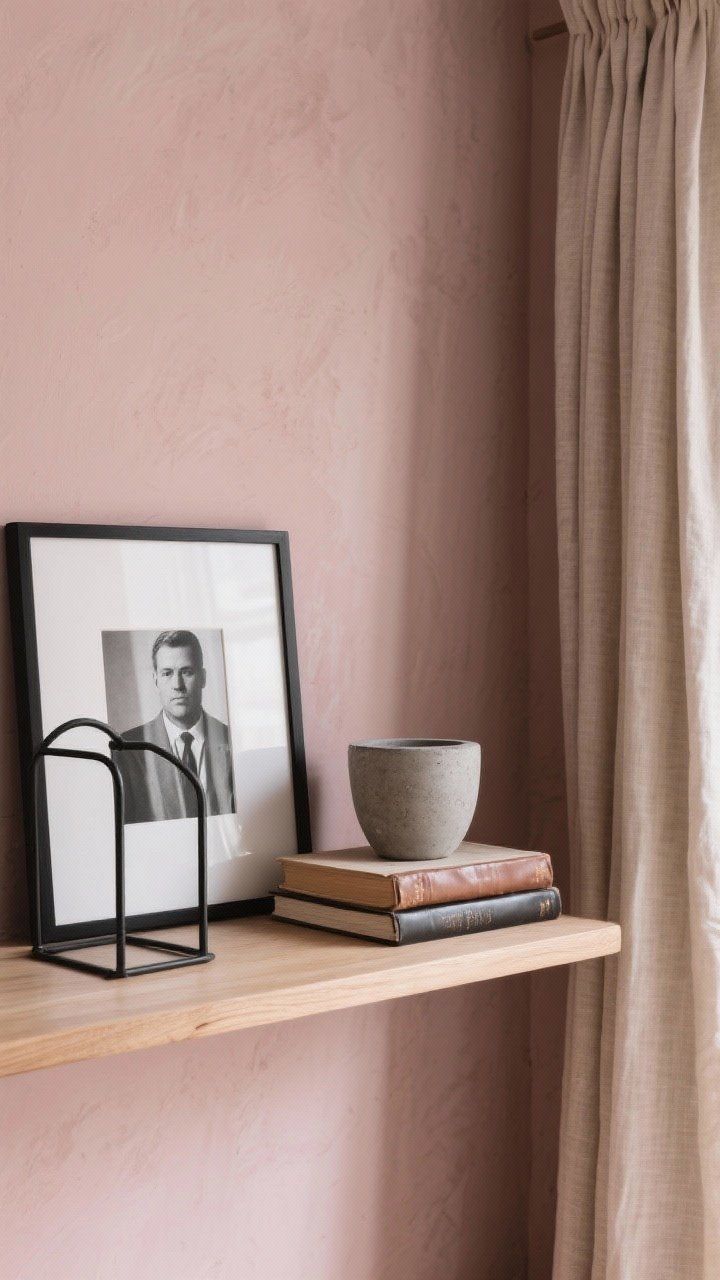
Hear me out: dusty blush is the grown-up pink. It’s warm, muted, and shockingly neutral when styled with earthy wood and black metal.
Why It Works
- Flattering glow: Makes skin—and spaces—look radiant.
- Pairs with masculine elements: Leather, concrete, and matte black offset the sweetness.
Pro Tips
- Choose a taupe-leaning blush like Setting Plaster or Sulking Room Pink.
- Keep decor simple: linen curtains, black frames, clean lines.
- Skip glossy finishes—matte makes it luxe, not bubblegum.
6. Charcoal Gray: Sleek, Modern, Surprisingly Cozy
Charcoal is like a great blazer—sharp, versatile, and instantly elevating. It’s perfect for creating a modern, sophisticated living room with minimal effort.
Why It Works
- Creates contrast with white trim and light furnishings.
- Hides imperfections better than lighter paints.
Pro Tips
- Try Iron Ore or Cheating Heart for deep, rich tones.
- Style with warm wood, cozy textiles, and soft lighting so it never feels cold.
- Consider a one-wall accent if your room is small.
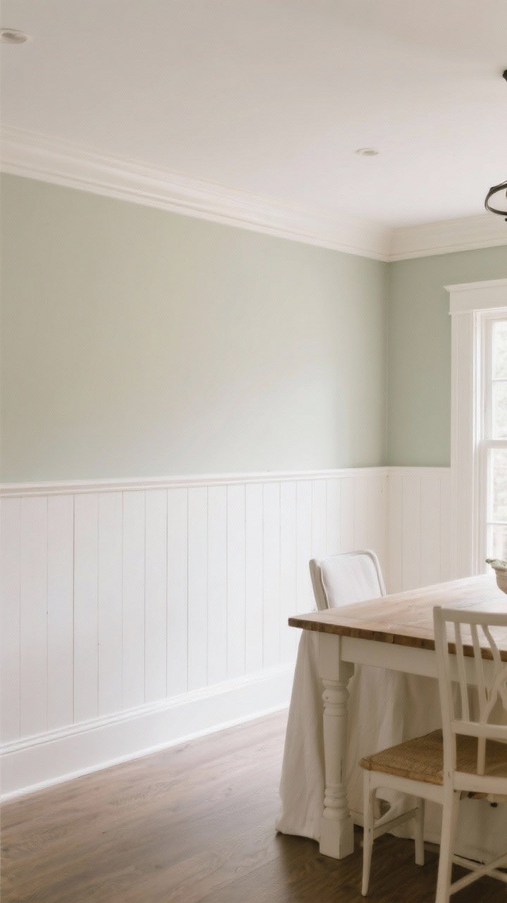
7. Soft Sage: The Calm-Down Color
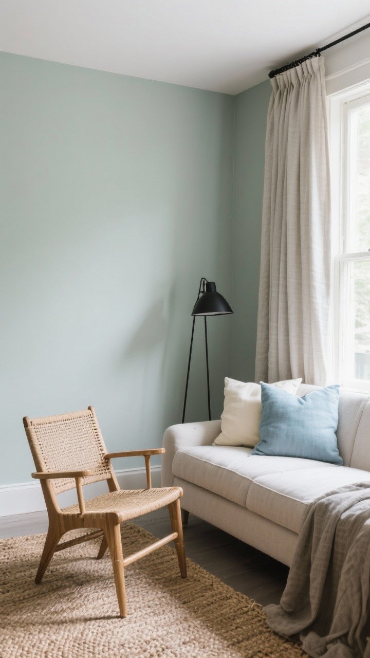
If your living room doubles as a stress-relief zone, go soft sage. It’s subtle, airy, and instantly peaceful—like a deep breath for your walls.
Why It Works
- Restorative vibes without being boring.
- Works with neutrals and soft blues for a cohesive palette.
Pro Tips
- Look for shades with gray undertones to keep it modern.
- Layer natural textures: jute rug, rattan, linen drapery.
- Add a matte black floor lamp for just-right contrast.
8. Creamy Beige: Cozy Without Going Yellow
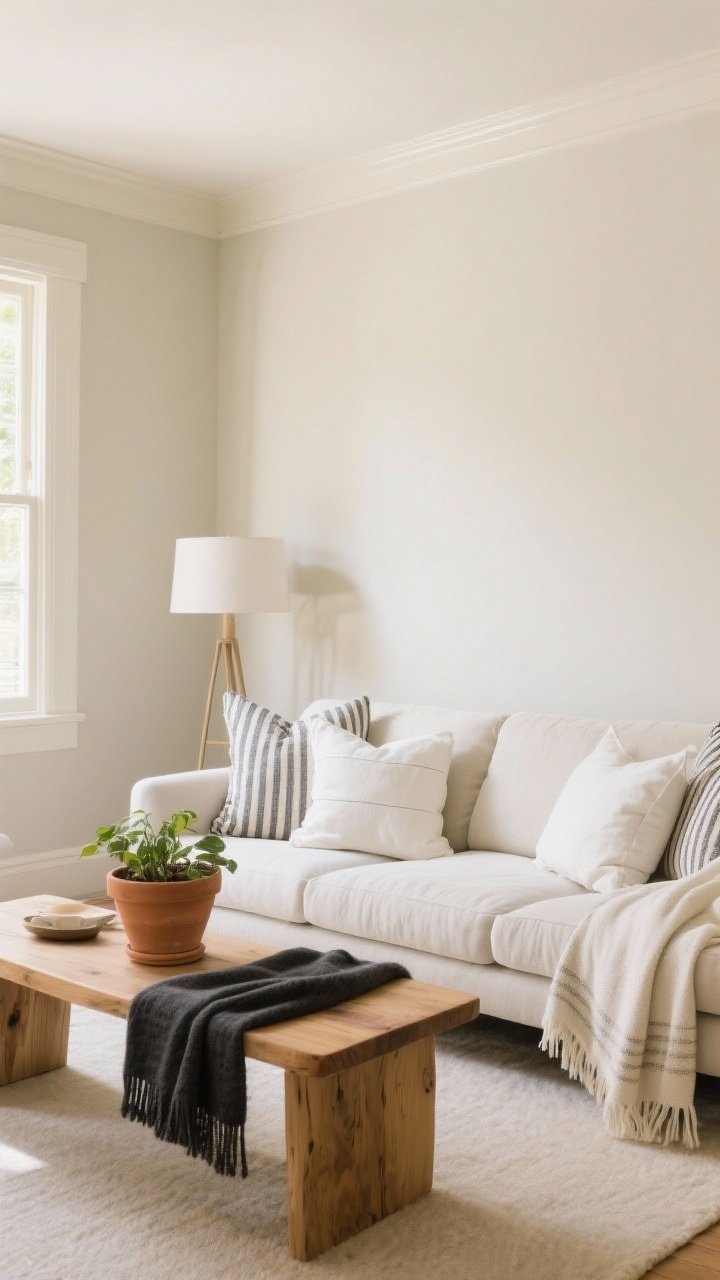
Beige is back—don’t fight it. A creamy, well-balanced beige brings warmth without the banana peel tones of the early 2000s.
Why It Works
- Timeless and soft—ideal for rental refreshes or resales.
- Plays well with terracotta, oak, and charcoal.
Pro Tips
- Try Edgecomb Gray (a greige-beige) or Natural Linen.
- Use layered whites (pillows, throws) so it reads intentional, not bland.
- Mix in pattern—think stripes or checks—to add personality.
9. Deep Teal: Statement-Making But Surprisingly Livable
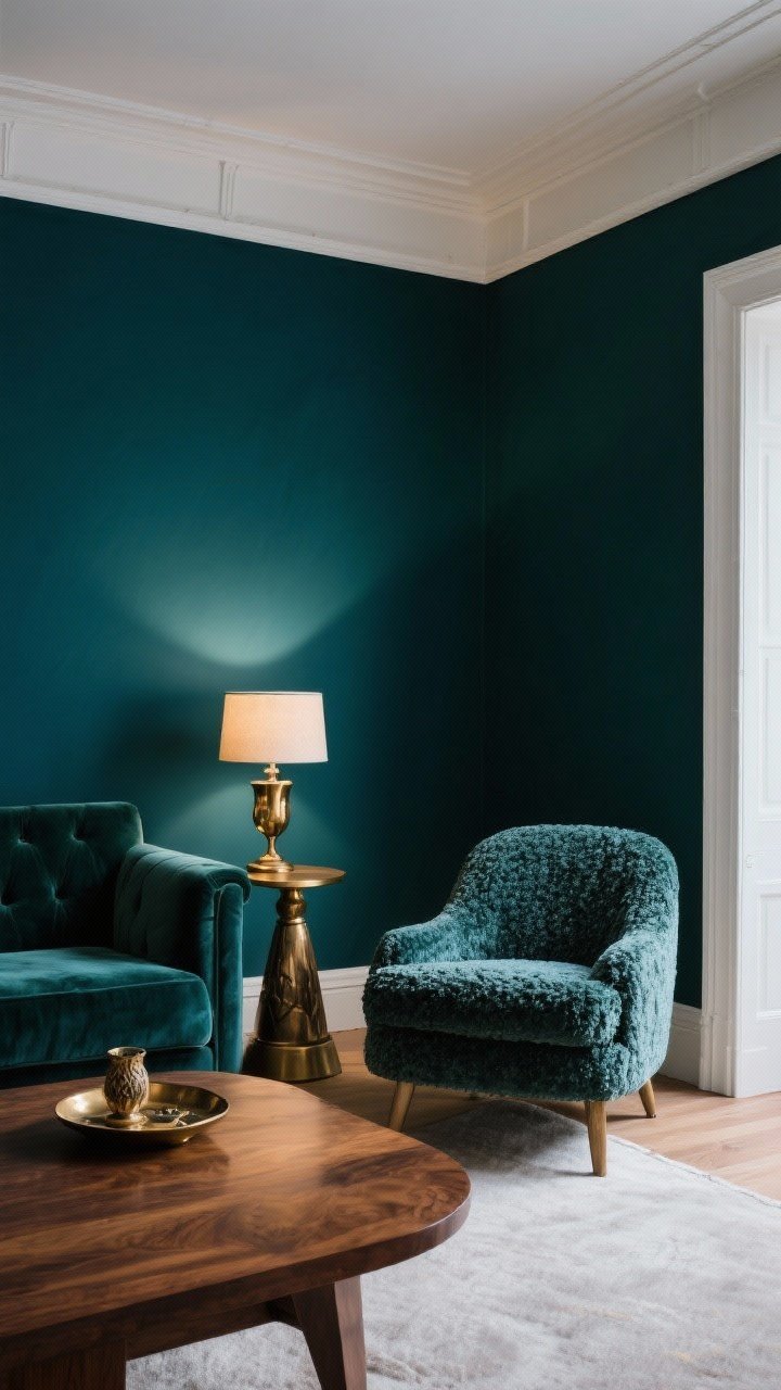
Teal brings jewel-toned richness without screaming for attention. It’s moody, lush, and creates the kind of living room that feels like a stylish hotel lounge—FYI: guests will linger.
Why It Works
- Color depth adds sophistication and drama.
- Enhances metals like brass, gold, and antique bronze.
Pro Tips
- Keep the ceiling and trim white for breathing room.
- Bring in velvet or boucle for a luxe finish.
- Balance with warm wood to avoid a cold, oceany vibe.
10. Muted Terracotta: Warm, Earthy, And So On-Trend
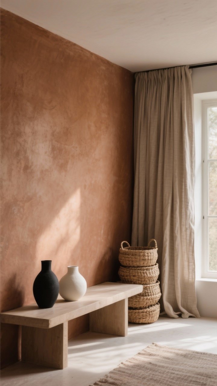
Terracotta is basically sunshine in paint form—but make it muted. It’s earthy and modern, and it pairs beautifully with neutrals and natural materials.
Why It Works
- Adds warmth instantly, especially in north-facing rooms.
- Plays nicely with black, beige, and bone whites.
Pro Tips
- Choose clay-inspired shades with brown undertones, not orange.
- Use matte finishes to keep it sophisticated, not spicy.
- Layer linen curtains and woven baskets for texture.
11. Pale Blue-Gray: Light, Airy, Effortlessly Coastal
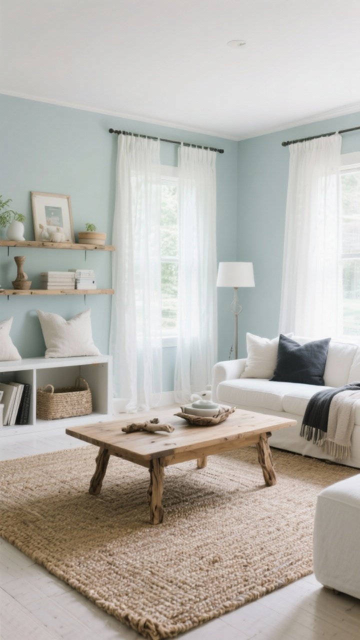
Want that breezy, relaxed vibe without going full seashell decor? Try blue-gray. It’s fresh, subtle, and doesn’t fight your furniture.
Why It Works
- Expands space visually, especially in small rooms.
- Plays well with whites, oak, and soft charcoal.
Pro Tips
- Look for green-leaning blues to prevent nursery vibes.
- Pair with natural textures: driftwood tones, sisal, linen.
- Use sheer curtains to let daylight bounce around.
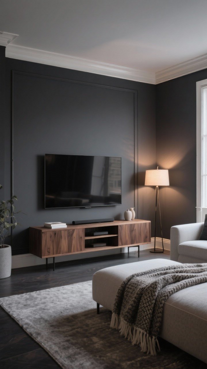
12. Black Accent Wall: Bold Move, Big Reward
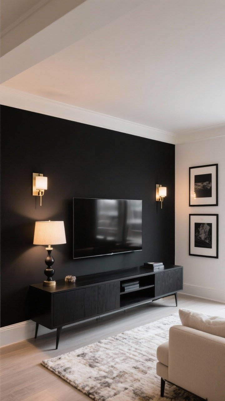
If you’re color-shy but love drama, do a black accent wall. It’s modern, striking, and ridiculously photogenic. Bonus: your TV blends in like magic.
Why It Works
- Creates focal point behind a sofa, fireplace, or media center.
- Defines zones in open-plan spaces without partitions.
Pro Tips
- Use a soft black like Tricorn Black or Off-Black.
- Balance with warm lighting and pale rugs to soften the look.
- Repeat black in small accents (frames, lamp bases) for cohesion.
How to Choose the Right Color (Without Panic)
- Test big swatches: Paint 2×3 ft samples on multiple walls. Watch them morning, afternoon, and evening.
- Check undertones: Compare your choice next to a pure white sheet to see if it leans pink, green, or yellow.
- Mind the light: North light is cool (go warmer); south light is warm (you can go cooler).
- Finish matters: Matte/eggshell for walls, satin for trim, semi-gloss for doors. FYI: matte hides flaws; glossy shows them.
- Build a palette: Pick a main wall color, a trim color, and 2–3 accent hues for textiles and decor.
Quick Styling Wins After You Paint
- Swap pillows to include your wall color in patterns—instant cohesion.
- Use contrast: Dark walls + light rug = drama; light walls + dark coffee table = grounding.
- Update hardware: Matte black or antique brass pulls and lamps make any color look intentional.
- Add plants: Greenery flatters every shade on this list. IMO, it’s basically a free upgrade.
Common Paint Mistakes (And Easy Fixes)
- Skipping primer: Your color won’t look right. Use stain-blocking primer, especially over dark or glossy paint.
- Wrong sheen: Shiny walls in a textured room = yikes. Choose eggshell or matte for most living rooms.
- Tiny samples: Those 2-inch chips lie. Use peel-and-stick or brush-on patches at least a foot wide.
- Ignoring the ceiling: A slightly lighter version of your wall color on the ceiling can make the room feel taller.
You don’t need to demo walls or buy a new sofa to transform your living room. One weekend, a couple of paint cans, and a plan—that’s it. Pick a shade that fits your vibe, test it like a pro, and go all in. Your future self (and your Instagram feed) will thank you.