12 Paint Color Ideas to Make Small Bathrooms Look Bigger (without a Renovation)
Small bathroom feeling more broom closet than spa? Same. The good news: the right paint color can instantly stretch your space—no sledgehammer required. We’re talking optical illusions, brighter light, and cleaner lines that make your bathroom feel fresh, airy, and way more expensive than it is.
Below are 12 paint color ideas to make small bathrooms look bigger, each with practical tips and pro tricks so you can actually pull them off. Grab a roller. Let’s fake some square footage.
1. Cloud-Soft White That Bounces Light

Classic, yes—but for good reason. A soft, warm white reflects tons of light and minimizes visual breaks, which makes walls recede and the room feel larger. It’s like turning your bathroom into a lightbox.
How to pull it off
- Look for whites with a hint of cream or gray (not stark blue-white) so it feels cozy, not clinical.
- Use the same white on walls, trim, and door for a seamless, “no edges” effect.
- Choose eggshell or satin on walls for easy cleanup and a subtle glow.
Try: Benjamin Moore White Dove, Sherwin-Williams Alabaster, Behr Swiss Coffee.
2. Pale Greige That Softens the Edges

Can’t choose between gray and beige? Greige is your neutral bestie. It warms up cool tile, cools down busy vanities, and wraps the room in a quiet, expansive vibe.
Why it works
- Neutral undertones help different materials “blend,” reducing visual clutter.
- Pairs beautifully with black fixtures for subtle contrast without chopping up the room.
Try: Farrow & Ball Skimming Stone, Sherwin-Williams Agreeable Gray, Valspar Gravity (lightened 25%).
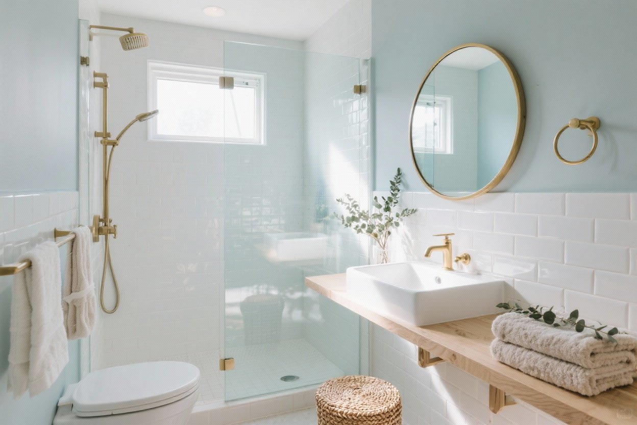
3. Misty Blue That Feels Like Fresh Air
A soft, misty blue makes walls feel like sky—aka infinite. It’s soothing, spa-y, and ideal if your bathroom has no natural light.
Pro tips
- Pick a blue with gray undertones—think “sea fog,” not baby nursery.
- Keep floors and towels in white and light wood to keep the palette airy.
Try: Benjamin Moore Glass Slipper, Behr Light Drizzle, Sherwin-Williams Misty.
4. Tone-on-Tone Ivory for a Seamless Look

A tone-on-tone palette (ivory walls + slightly creamier vanity + off-white trim) creates depth without hard contrast. Your eye floats; the room reads bigger.
Styling it
- Keep metallics soft—brushed nickel or champagne brass, not high-contrast black.
- Add tiny texture: linen shower curtain, ribbed towels, woven basket.
Try: Clare Whipped, Farrow & Ball Pointing, Sherwin-Williams Greek Villa.
5. Light Sage That Calms and Expands

Whisper-light sage adds color without feeling heavy. It plays well with marble, white tile, and natural wood, and it brings in a spa-level vibe without trying too hard.
Best practices
- Avoid saturated greens in tight spaces; stay pale and grayed for an airy effect.
- Use soft black or dark bronze hardware for gentle definition.
Try: Benjamin Moore Soft Fern, Sherwin-Williams Sea Salt, Behr Brook Green.
6. Blush Beige That Warms Without Closing In

Yes, blush—but think whisper, not bubblegum. A blush-beige brings warmth to cool tile and makes skin look amazing in the mirror. Priorities.
Make it chic, not sweet
- Look for muted, earthy pinks with brown undertones.
- Balance with matte black fixtures and crisp white towels.
Try: Farrow & Ball Setting Plaster, Benjamin Moore First Light, Clare Wing It.
7. Breezy Greige-Blue for That Boutique Hotel Feel

Can’t commit to blue or gray? A washed greige-blue walks the line beautifully. It cools down warm tile and gives that crisp, coastal energy—even if your bathroom faces an alley.
Pro moves
- Keep the ceiling one shade lighter to fake height.
- Use glossy white on trim to bounce extra light around.
Try: Sherwin-Williams Fleur de Sel, Benjamin Moore Solitude (lightened), Behr Reflecting Pool.
8. High-Contrast Ceiling in the Lightest Shade

Ready for a sneaky trick? Paint walls and ceiling the same color, but have the ceiling lightened 25–50%. It keeps the envelope cohesive while subtly lifting the ceiling visually. Magic.
How to do it
- Ask the paint desk to custom lighten the ceiling formula—easy peasy.
- Use semi-gloss or satin on the ceiling in humid bathrooms to resist moisture and reflect light.
Works with: Any pale neutral or soft color from this list.
9. Pale Taupe for Soft Shadow and Depth
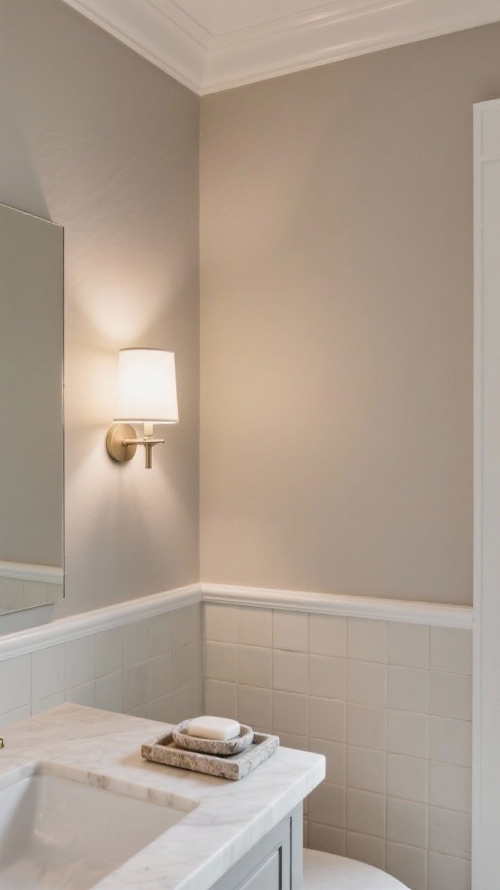
Pale taupe adds gentle dimension that plain white can’t. You get just enough contrast with tile and trim, which makes the room feel layered, not flat, without making it feel smaller.
Design details
- Pair with warm bulbs (2700–3000K) to avoid a gray cast.
- Choose creamy grout and stone accessories to keep the look cohesive.
Try: Benjamin Moore Balboa Mist, Farrow & Ball Joa’s White (lightened), Sherwin-Williams Accessible Beige.
10. Dusty Lavender-Gray for a Luxe Glow
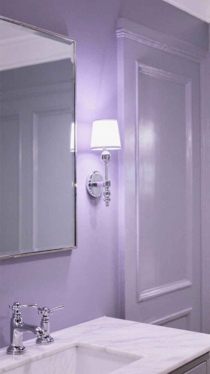
Hear me out: a muted lavender-gray is insanely flattering and sophisticated. It reads like a chic neutral with a secret personality, and it reflects light in the prettiest way.
Keep it elevated
- Stick to gray-leaning purples (no grape soda vibes).
- Use chrome or polished nickel for a clean, hotel-bathroom shimmer.
Try: Benjamin Moore Silver Fox (violet undertone), Farrow & Ball Peignoir, Sherwin-Williams Imagine.
11. Soft Black… On the Door Only

Want a little drama without shrinking the room? Paint the door soft black (keep walls light). It adds chic contrast that makes surrounding walls feel brighter and more expansive.
Execution tips
- Use satin or semi-gloss on the door for durability and a subtle sheen.
- Repeat the black in a mirror frame or cabinet pulls for continuity.
Try: Benjamin Moore Wrought Iron, Sherwin-Williams Iron Ore, Behr Cracked Pepper.
12. Monochrome Tile Match for a Built-In Look
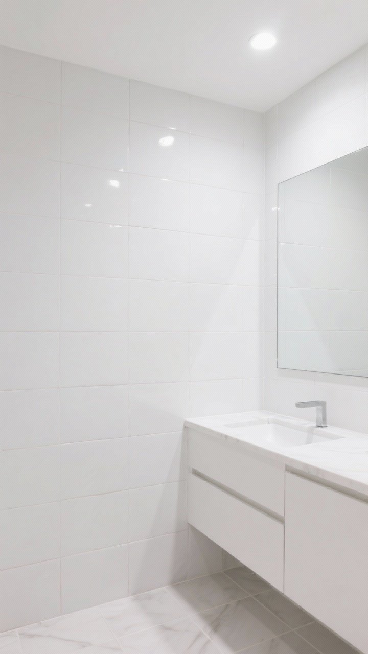
Got white or light tile? Color-match your paint to the tile or go one shade lighter. When walls and tile read as one continuous surface, the room instantly looks larger and calmer.
How to nail the match
- Bring a tile sample to the paint store for a scan (or do side-by-side swatches at home).
- Use the same hue on walls, trim, and vanity for a custom, built-in feel.
Bonus: Fewer competing tones = fewer visual breaks = more “space.”
Extra Tricks to Maximize Your Chosen Color
Finish matters
- Eggshell or satin on walls: light-reflective and wipeable.
- Semi-gloss on trim/doors: bounce more light and withstand moisture.
- Matte ceiling: hides imperfections; consider a moisture-resistant formula.
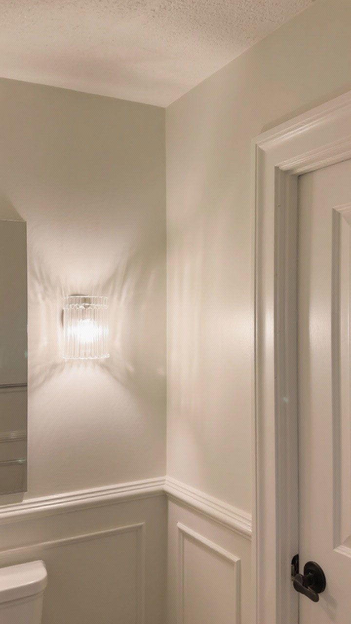
Lighting is half the battle (FYI)
- Swap cold bulbs for 2700–3000K warm LEDs.
- Use frosted glass sconces to diffuse light evenly and avoid shadows.
Keep contrast low
- Stick to 2–3 coordinating tones overall.
- Choose towels and shower curtains that blend with your wall color for continuity.
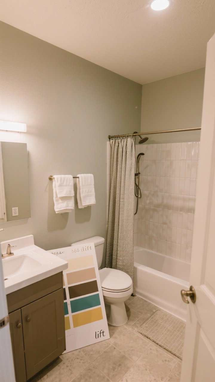
Sample like a pro
- Paint large swatches on foam boards and move them around the room at different times of day.
- Check near tile, vanity, and floor—undertones shift next to different materials (IMO, this step is everything).
Don’t forget the ceiling height trick
- Paint the ceiling the same color as the walls to erase the hard line.
- Or bring wall color up onto the ceiling by 3–6 inches to “lift” the room.
Conclusion
You don’t need more square footage—you just need smarter color. From cloud-soft whites to misty blues and tone-on-tone neutrals, these 12 paint color ideas will help your small bathroom breathe, shine, and feel way bigger. Start with a few swatches, test in your lighting, and go for a finish that adds a gentle glow. Your tiny bath is about to have main-character energy.